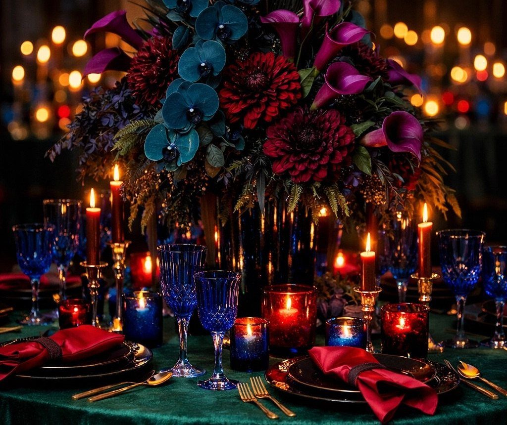
The ideas below range from a single chair sash to the full cost of recoloring your venue with draping and linens, and the one that belongs to you depends on whether you need one bold accent or a complete palette rewrite.
Your starting point is the base color you choose, since every other decision, from metallic accents to bridesmaid dress fabric, branches from that first commitment.
The visible ceremony uses teal, magenta, purple, and orange sashes in a repeating pattern down the aisle, which is the kind of specific combination that only makes sense once emerald or ruby has already been named as your lead.
1. Floral Arrangements
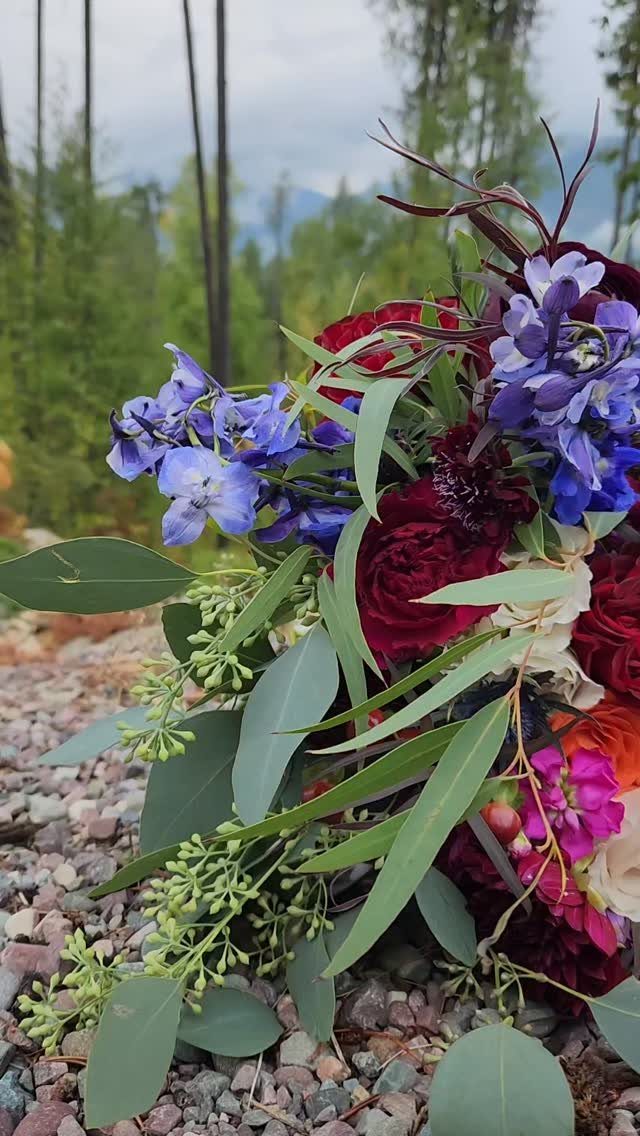
Deep burgundy and plum flowers, usually passed over for softer palettes, finally get to lead. Garden roses, dahlias, and ranunculus in ruby or garnet shades pair with eucalyptus and ferns for a lush, layered look.
For a cooler direction, blue delphiniums and thistle work against silver-leafed dusty miller. Dried pampas in cream keeps the arrangement from feeling too heavy.
I like adding figs or pomegranates for texture, though they are not essential. The overall effect is dense and romantic without reading dark, which is the balance that makes jewel-tone florals feel celebratory rather than somber.

❤️ Floral Set: This set features a diverse mix of handcrafted flowers, including various types and colors of silk and foam blossoms, as well as greenery. Ideal for bridal and bridesmaid bouquets, floral arrangements, table centerpieces, and more.

Magenta & Plum Berry Tone Design: 17'' dried flower bouquet features a bold, eye-catching palette of rich magenta, deep plum purple, and burgundy tones, accented with soft lavender and off-white pampas grass. This jewel-tone, berry-inspired arrangement brings a romantic, vibrant pop of color to any space, perfect for fans of modern boho and eclectic decor styles.

For a classic, elegant look, the artificial flower combo of classic Burgundy and Royal Navy blue is never outdated perfect collocation, the vivid permed hydrangea and leaves add vivaciousness. It will be a perfect bouquet in your sweet and unforgettable wedding
2. Wedding Invitations
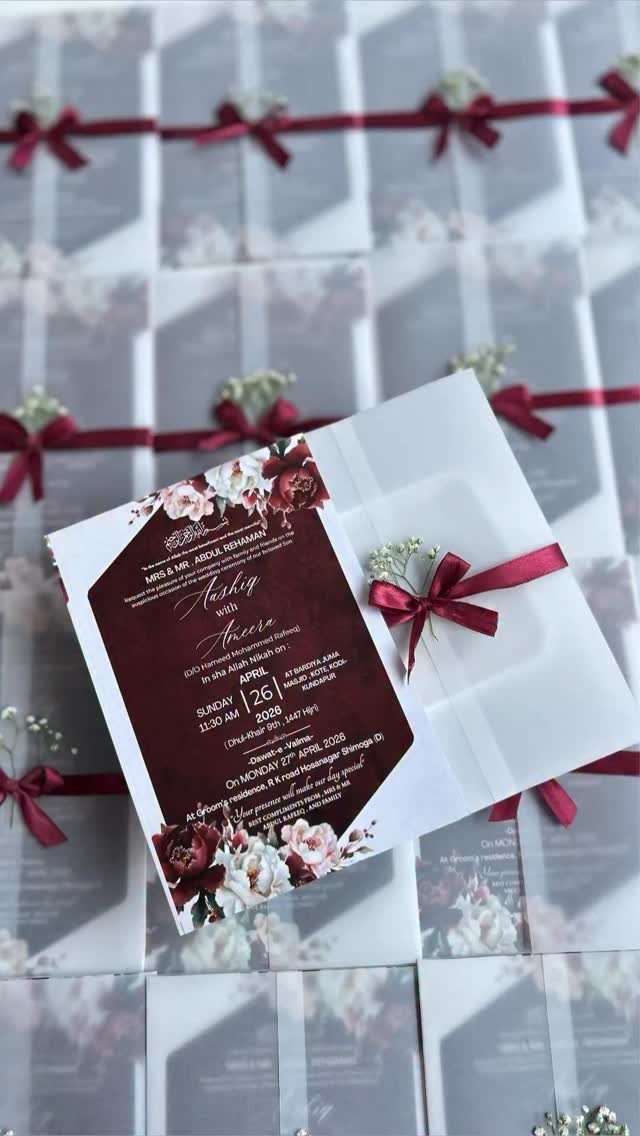
Your invitation is the first place guests touch your palette, so the paper and print method matter as much as the color.
Deep burgundy or red wine stock with gold foil stamping reads luxurious; translucent vellum wraps tied with ribbon soften the formality. Jewel-themed motifs like small illustrated stones or geometric facets hint at the theme without stating it outright.
I would choose a matte stock for darker colors, since gloss can turn jewel tones theatrical in the wrong light. Metallic accents work best as one element, not three.

Packaging: Bulk package includes 16 chair sashes, 16 Artificial Eucalyptus Stem, 8 clear non-marking tapes and 16 meters ribbons. Upgraded Material: Our chair sashes are made...
3. Wedding Cake
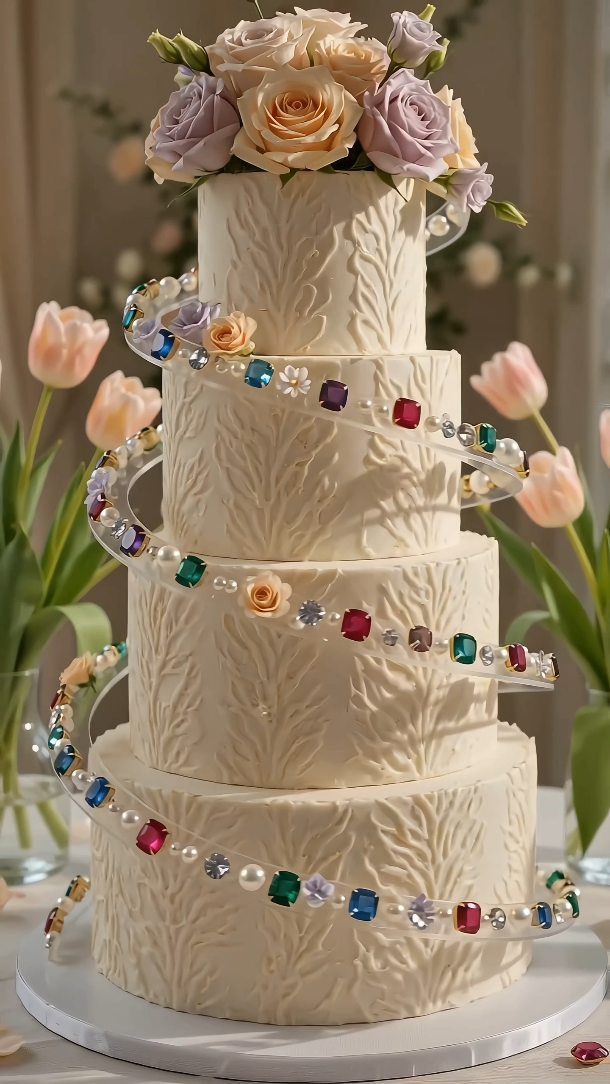
A white or neutral cake base lets jewel tones read as intentional accents rather than overwhelming color. The visible cake uses faux gemstones in a spiral band for sparkle; fresh flowers in deep tones work similarly.
Geode-style detailing in amethyst or plum is a specific technique that suits this look well. I prefer the cleaner versions; too many competing jewel elements on one cake tends to look busy in photos.

💌 Package included: 50 pieces luxury A7 gold foil liner euro flap envelopes + 50 Gold Seals. Add a touch of timeless elegance to your special events with our Euro Flap Envelopes with Gold Floral Liner!

【Package include】Package comes with 25 Gold glitter laser cut wedding invitations + 25 inner Sheets (default blank)+ 25 envelopes, + 25 burgundy ribbons + 25 gold envelopes seals.

4. Warm Lighting
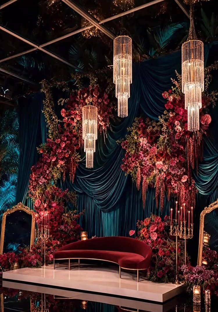
Jewel tones shift dramatically under different light, and cool tones especially can flatten under bright white bulbs. Candlelight, warm fairy lights, or chandeliers with amber-toned bulbs bring out the depth in emerald, sapphire, or amethyst without muddying them.
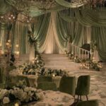
The visible setup uses crystal chandeliers and tall gold candelabras against teal draping; the warmth of the metal and flame keeps the cool palette from feeling cold.
I would avoid mixing color-temperature sources in one space, since LED spots against candle flame creates a clash that works against the richness you are paying for.

✔PRODUCT INCLUDES: You will receive 3 pieces of crystal candle holders in 3 sizes, 3 different heights will give you different visual feelings when using them, the solid round base with cushion will make this set of crystal candle holders stable Stands firmly on any tabletop and protects from scratches, moisture or damage.

Decorative dangling crystals:they are charming gifts for your loved one to celebrate christmas, birthday, anniversary, wedding, etc,ceiling light pendant

SAFE & BEAUTIFUL: These flameless taper candles allow you to have a perfect environment at night, safe and secure; no need to worry about potential fire hazards, secondhand smoke, messy dripping wax or dyed tablecloths. These kid-friendly LED flickering window candles are a great choice for any family with children or pets.
5. Bridesmaid Dresses
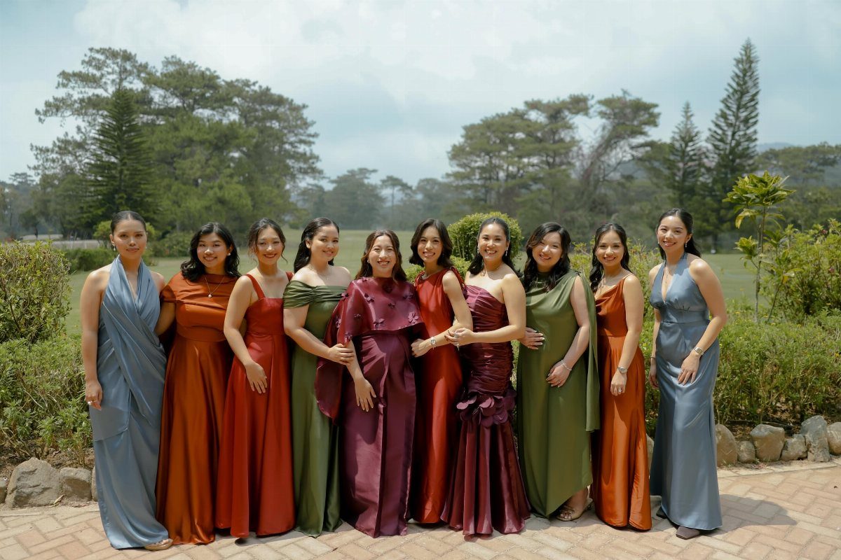
Mismatched jewel tones across your bridal party create visual interest without requiring anyone to wear a color that does not suit them. One element needs to stay constant: all satin, or all velvet, in ruby, citrine, emerald, sapphire, and amethyst.
The visible group uses slate blue, burnt orange, olive green, and deep plum with a consistent satin finish, which is what lets the variation feel chosen rather than accidental.
Single-color groups work too; metallic accents like a thin belt or sequin detail add sparkle without breaking cohesion. I would decide based on your venue’s existing color load.

Unique Artifical Flowers: Gentle roses and Peonies are gorgeous and refreshing, the lifelike silk flowers box set will create a mood of charming, romantic and fantasy. Keep the bouquet after event, keep the memory stay. It will be a perfect bouquet in your sweet and unforgettable day
6. Table Settings
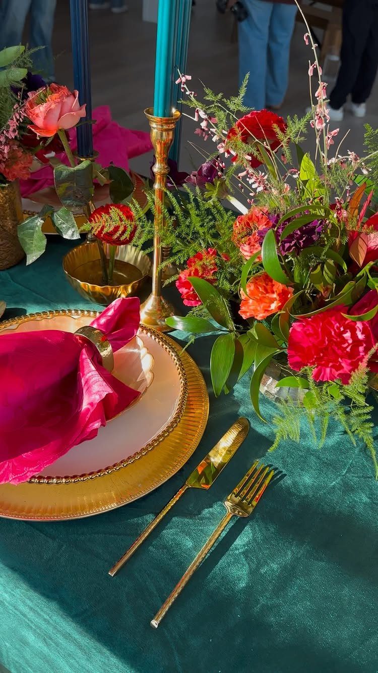
Colored linens are the fastest way to transform a standard rental space. An emerald or teal tablecloth with gold chargers and flatware reads formal without additional decoration; the visible setting adds magenta napkins and brass candle holders for more layers.
Jewel-toned glassware is a detail guests notice when they sit down, though it requires renting rather than using venue stock. Copper flatware against burgundy creates a quieter, more vintage effect than gold.
I would choose either bold linens with neutral settings or neutral linens with colored glass and candles, not both; the table needs negative space to avoid looking like a display rather than a place to eat.
7. Accessories
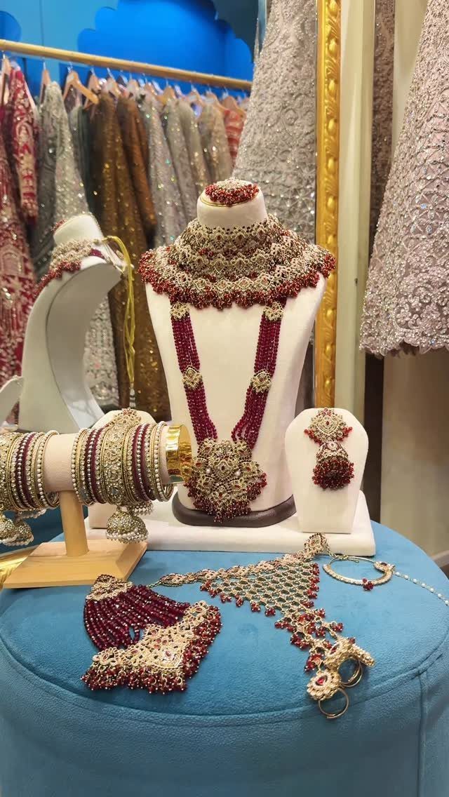
Ruby and gold bridal jewelry against white or cream fabric reads intentional rather than costume.
The visible set uses ornate gold settings with deep red stones; that combination works because the metal and stone share warmth. A jeweled crown or hairpiece needs to suit your hairstyle’s weight and structure, not just its color.
I would keep necklaces simple when earrings or a crown carry the jewel tone, since 3 strong pieces compete for attention. One bold accessory carries the theme; the rest should support it quietly.
8. Centerpieces
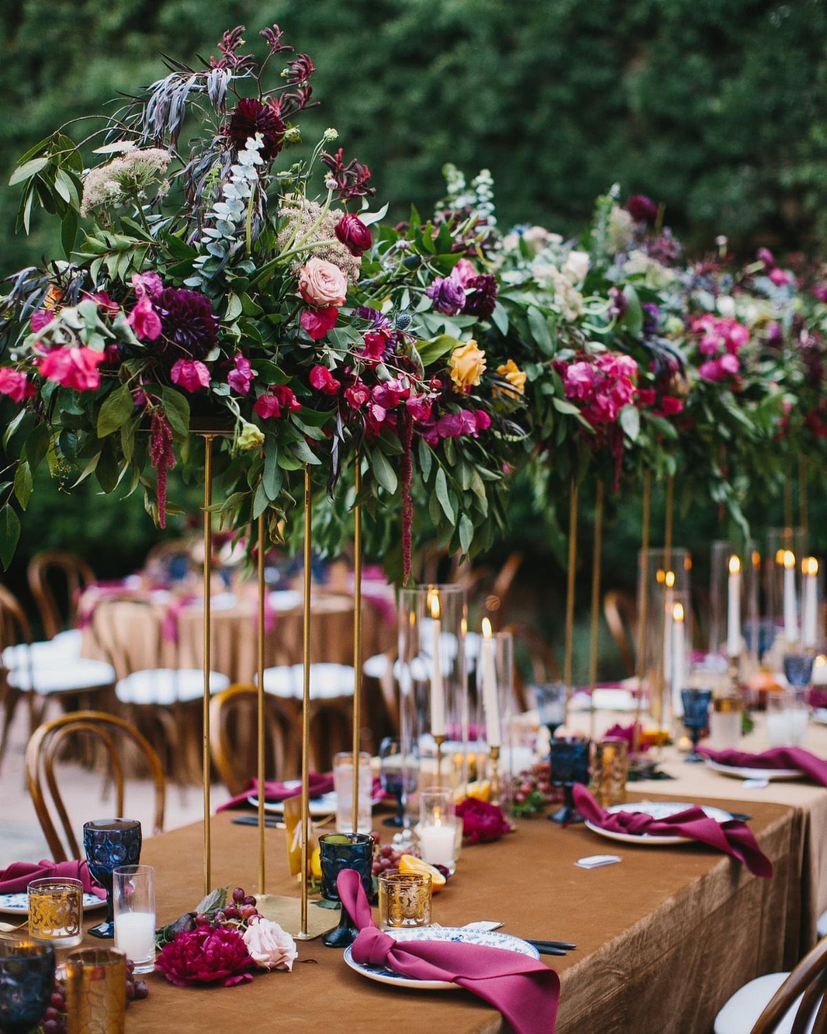
Tall gold stands lift jewel-tone arrangements above eye level so guests can talk across the table. The visible setup uses burgundy dahlias, magenta blooms, and layered greenery; varying height between tables keeps the room from flattening into a single plane.
Small crystal clusters or thin geode slices at the base echo the gemstone idea without turning the table into a mineral display.
I would use either tall dramatic pieces or low clustered bowls at a single table, not both; mixing heights on one surface blocks sight lines.
A low candle between 2 arrangements fills the middle space and keeps the overall effect warm.
9. Jewel-Toned Wedding Fashion
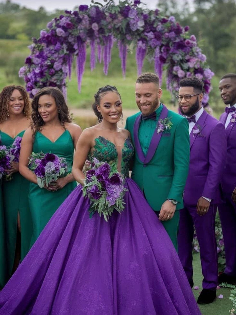
The visible group coordinates the bride’s purple-green gown with bridesmaids in solid green and groomsmen in purple; the groom matches the bridesmaids rather than the bride, which is a choice that keeps him from disappearing into her silhouette.
Bold color in wedding fashion needs fabric with body: velvet, heavy satin, or structured crepe hold jewel tones better than chiffon or lightweight silks that can read washed out.
I would check venue lighting on the actual fabric before finalizing; emerald under warm bulbs shifts toward forest, which may or may not be what you want.

VIBRANT JEWEL TONES – Infuse your space with rich, deep hues that command attention. These high-quality artificial blooms feature a sophisticated color palette designed to elevate any room's ambiance with a touch of luxury. NO VASE INCLUDED
10. Jewel-Toned Chair Sashes
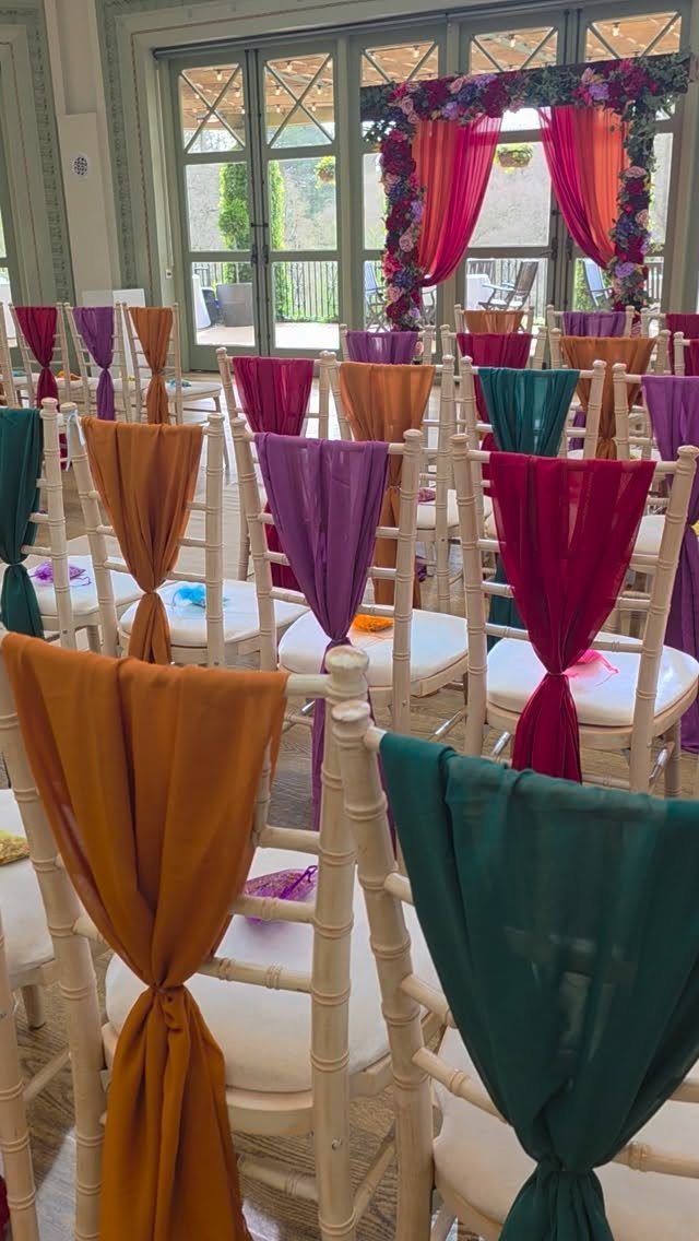
Sheer sashes in alternating jewel tones on white Chiavari chairs add color without the cost of replacing rental seating.
The visible ceremony uses orange, green, purple, and magenta in a repeating pattern down the aisle; that rhythm works for processional viewing but a random or ombre placement suits reception tables better.
Fabric weight matters: too heavy and the sash overwhelms the chair back, too light and it reads as an afterthought.
I would match the sash material to something else in the space, the draping on the arch or a linen texture, so the detail feels planned rather than purchased separately.
Choosing a Base Color
Pick one jewel tone to carry the weight of your palette. Emerald, ruby, or deep purple each work as the dominant shade across your stationery, florals, and linens.
From there, bring in one or two supporting tones in smaller doses: a bridesmaid dress in citrine, candles in sapphire, ribbon in garnet. This keeps the mix intentional rather than scattered.
Black, white, or cream all work as the grounding element; without it, the colors compete instead of coordinate.
The difference between a palette that reads luxurious and one that reads chaotic is usually that neutral base and the discipline to keep your hero color in the lead.
Photogenic Appeal
Jewel tones solve a real problem wedding photographers face: most palettes disappear against white dresses and cream linens. Deep ruby, sapphire, and emerald hold enough saturation to create visible contrast in every lighting condition.
Daylight gives these colors dimension and depth; as the sun drops, they shift into a moodier register without going flat.
The pigments catch warm chandelier light differently than pastel washes do, which means your reception shots keep the same visual weight as your ceremony photos.
Close-ups benefit too. Saturated petals show texture and detail that lighter colors lose to overexposure.
The color itself becomes a compositional tool, directing the eye toward focal points rather than letting them dissolve into the background. Whether your venue is a garden or a ballroom, jewel tones give the camera something to work with.
Metallic Accents
Gold works across every jewel tone without clashing, which is why it is the safest metallic choice if you want one accent throughout.
Bronze and copper pair specifically well with ruby and garnet; their warmth picks up the red undertone rather than fighting it. Silver suits sapphire and amethyst, where its coolness extends the blue-violet range rather than interrupting it.
In practice, this means your metallic choice can follow your dominant color instead of defaulting to gold everywhere.
A sapphire-heavy palette with silver flatware and candlesticks reads more considered than silver scattered at random. The same rule applies to neutrals: deep cream and ivory soften jewel tones without washing them out, while black pushes them toward high drama.
I would pick one metallic and one neutral and stay consistent; mixing gold and silver in the same sight line tends to look unplanned unless the contrast itself is the point.
Creating a Luxurious Atmosphere
Jewel tones create warmth through saturation rather than through orange or yellow pigment.
A deep emerald wall or amethyst linen absorbs light and reflects it back in a concentrated band, which makes a room feel enclosed and intentional rather than cavernous.
This is why the palette suits intimate celebrations especially well: the colors do the work of bringing the walls in.
Texture extends the effect. Velvet or silk in jewel tones catches light on their surface irregularities, so the color shifts slightly as guests move through the space.
A ruby bouquet against a velvet dress in a deeper red creates variation within a single tone. Metallic or crystal surfaces amplify this by throwing reflected color across the room.
The result is an environment that reads as layered rather than decorated, which is the difference between a space that feels expensive and one that merely looks expensive.
Frequently Asked Questions
Are jewel tones in for 2026?
Jewel tones are definitely in for 2026.
Pastels fade into each other until the whole table looks like a single wash; jewel tones do the opposite. Set sapphire next to emerald and both colors turn louder, not muddier.
What is jewel tone attire?
Jewel tone attire means clothing in deep, saturated colors named after precious gemstones, such as emerald green, sapphire blue, ruby red, and amethyst purple.
These shades are often paired with gold or silver accents and work across bridesmaid dresses, groomsmen accessories, and even bridal gowns for a rich, refined look.
What are the 2026 wedding color trends?
Deep blue and sapphire hues, forest green and emerald elegance, rich reds and ruby tones, golden mustards and amber glow, and royal purples with amethyst accents are all trending for 2026.
Jewel tones as a category continue to grow in popularity because they photograph with remarkable depth and suit both modern and traditional themes.
What skin tone do jewel tones look good on?
Pink, red, blue, and purple jewel shades pull pink undertones forward on cooler complexions.
Orange, yellow, brown, and green jewel tones do the same for warmth in the skin. The depth and saturation of jewel tones generally suit a wider range of complexions than paler washes do.
What are the main jewel tones for weddings?
Emerald, sapphire, ruby, amethyst, garnet, and topaz are the names I hear most often from florists and stationers. Each is a gemstone name standing in for a deep, saturated color.
Every color on that list takes its name from a stone, and all share the same quality: saturation pushed so deep that the color seems to glow from inside rather than sitting on the surface.
Can you mix jewel tones, or should you pick one?
You can absolutely mix them. A true multi-jewel palette works too, but requires a consistent neutral and a metallic thread to hold it together.