Gold wedding colors run from a single foil accent on navy stationery to full draped ceremony backdrops that cost triple what floral installations would, and the deciding factor is how much architecture your venue already provides.
Burgundy roses and gold metallic accents need moldings and paneling to feel at home; blush floral arrangements with gold accents belong in a garden where the pairing reads as found.
1. Champagne and Gold Palette
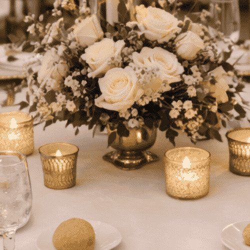
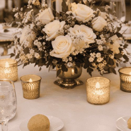
Champagne silk on bridesmaids catches light differently than stark white, and the gold around it reads warmer for that. I like this pairing for evening receptions where candles do the work; the palette drinks in lamplight rather than fighting it.
White bouquets with cream undertones keep the bridal party distinct without introducing a third color that competes. Gold votives and rimmed glassware carry the metallic through at table height, where guests actually notice.
The risk is flatness: too much champagne and the room goes beige. I would keep greenery sharp, not soft, and place gold in at least 2 textures, polished and brushed, so the eye has somewhere to travel.

3 Functions In One: This fake flower can be used as a tabletop decoration with the flower stand sold in our store, or it can be hung on the wall as a wall-hanging flower decoration. Third, two fake roses bouquets can be tied together with the ties (included in the package) as a large floral ball to hang in the center of the ornament. See the pictures for details.

DISTINCTIVE BURGUNDY+GOLD DESIGN -- Giving a Gorgeous But Timeless Look: We chose to add gold to the top of the burgundy cup body to add a sense of sophistication, perfect for burgundy and gold-themed decoration. Mercury speckled effect on the votive candle holders will enhance the natural warm light of candles, keep shining in your life.

Includes 2 pcs 3.94" height wedding centerpieces vase. The base diameter is 3.94", and the Upper diameter is 6.22". Flowers are not included. Perfect for office or home décor
2. Burgundy Roses and Gold Metallic Accents
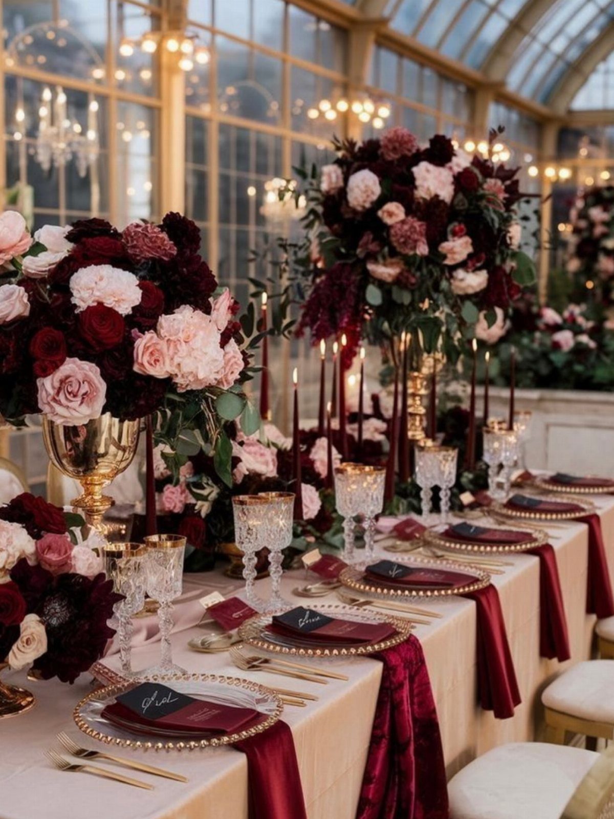
Gold urns and chargers against burgundy roses do the heavy lifting here; the flowers provide depth and the metal provides the occasion.
I have seen this palette read Victorian when the gold goes ornate, and modern when the shapes stay simple. Classical urns call for plain cutlery and chargers, almost hotel-silver in profile, just in gold finish.
Taper candles in burgundy, not white, keep the color vertical and moving. Cream flowers mixed in soften the contrast for afternoon light; for evening, I would drop them and let the burgundy go darker.
This combination demands a venue with some architecture. In a tent or blank ballroom, it can feel like costuming without a stage.

4 Packs green and gold plastic tablecloths: designed with reliable PEVA material, these disposable party table cloths come in about 54 x 108 inches, large enough to cover any rectangle table up to 8 inches; Moreover, our plastic graduation tablecloth covers are serviceable, not easy to tear, charming and attractive; Spill proof and stain resistant design provides ideal protection to your table

Package Includes: You will receive 6 sage green and gold dot tablecloths, each sage green tablecloth measures approx 54 x 108 inches, fit any rectangle table up to 8 feet in length, suitable for party decoration.

Quantity: 5 Napkins Material: Polyester Color: Hunter Emerald Green | Gold Design: Gold Foil Geometric Pattern Size: 20"x20" (unfolded) Foil Pattern Width: 0.4" How to Care: To protect the golden pattern, use cold water to wash gently, no scrubbing. Iron with cover. Do not bleach, do not dry clean, drip dry. Napkins are seamless, 1pc design Hemmed edges for an exquisite look
3. Emerald Green Linens and Gold Chargers
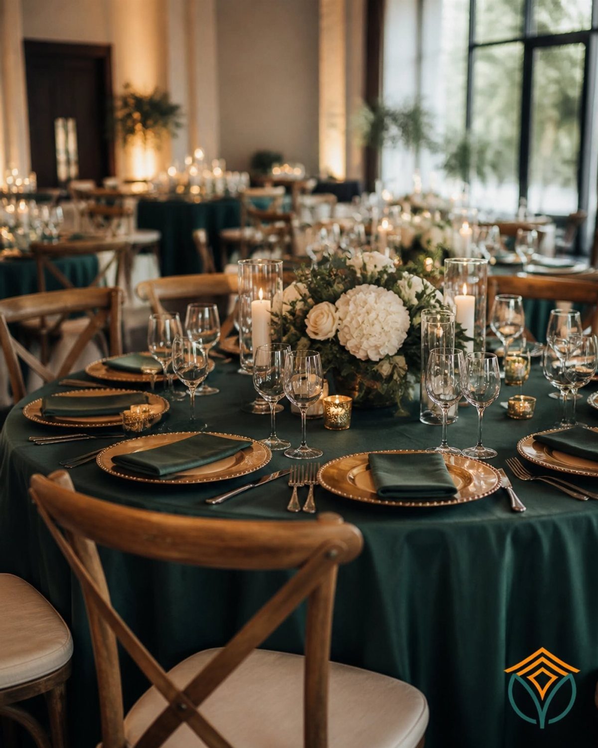
Deep green tablecloths make gold chargers pop in a way white or blush never manages; the metal reads earned rather than applied.
I would use this for a winter wedding or any room with dark wood paneling, where the green belongs instead of arriving as a statement.
White centerpieces, not ivory, keep the contrast clean.
Folded green napkins that match the linen exactly beat a third green, which fragments the table. Cross-back chairs in natural wood warm the whole arrangement without adding another finish to manage.
The limit is the linen quality.
Cheap emerald polyester shines wrong and cheapens the gold by association. Rent the best you can, or go with a lighter green in lesser fabric.

High Quality & Durable : Made of 100% spun polyester with strong stitching, soft and durable to protect your table surface from hot pans, scratches and spills.

PACK OF 1: Includes one champagne gold table runner measuring 27.5 x 120 inches / 10 ft for dining, wedding, dessert and party tables.
4. Black Linens and Gold Cutlery
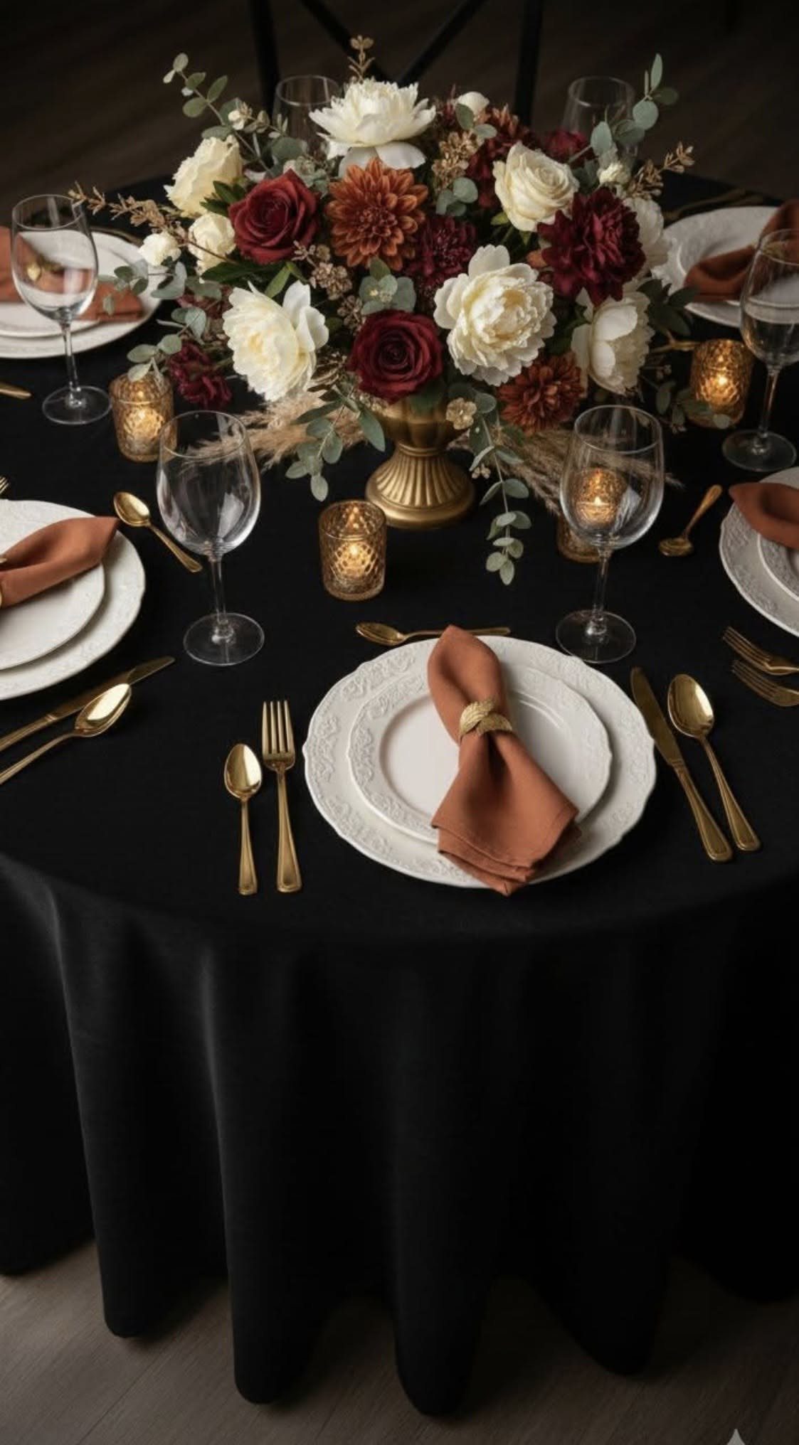
Black tablecloths swallow light, so the gold here is doing real work: catching what exists and returning it to the room.
I would not attempt this in a space without windows or strong fixtures; the tables go to holes without enough wattage.
Rust napkins open an autumn reading worth following through.
Burgundy or burnt orange in the flowers keeps the warmth concentrated at center, while the black and gold handle the perimeter formality. White china, not cream, maintains the graphic edge.
Gold flatware on black reads louder than on white; you need less of it to register. A single gold-rimmed charger or the cutlery alone suffices; both, and the table starts to shout.

ELEGANT BORDEAUX TAPER CANDLES: Includes two 12-inch Bordeaux taper candles in a rich, sophisticated burgundy hue, perfect for adding warmth and timeless elegance to dining tables, dinner parties, weddings, and special occasions.

INCREASE THE GLOW: Includes twelve 12-inch premium taper candles crafted with a quality paraffin wax blend. Each taper provides approximately 12 hours of beautiful, long-lasting burn time, giving you plenty of candlelight for dinners, celebrations, entertaining, and special occasions.
5. White Roses and Gold Chargers
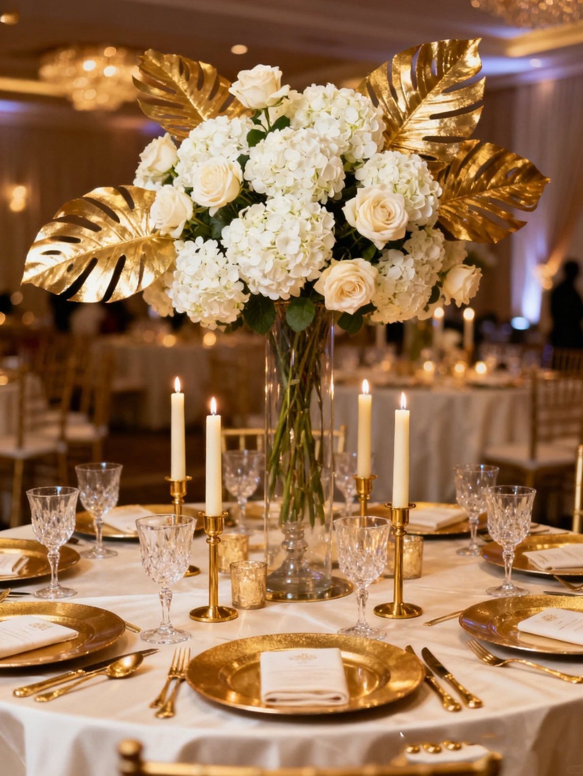
Spray-painted gold monstera leaves in the centerpiece are the move here; they bridge the floral white and the metallic tableware without introducing another living element to wilt or brown.
I would ask a florist comfortable with painted botanicals, not attempt this with a purist.
Tall gold stands lift white floral arrangements to fill vertical space without blocking sightlines across the table, which matters more in rooms with high ceilings than you might think.
For larger tables, cluster three short arrangements instead of one tall centerpiece.
Cream linens, not pure white, keep the roses from looking institutional against the gold warmth. The taper candles should match the linen, not the flowers, so nothing competes with the leaves.
6. Gold Metallic Accents in Table Settings
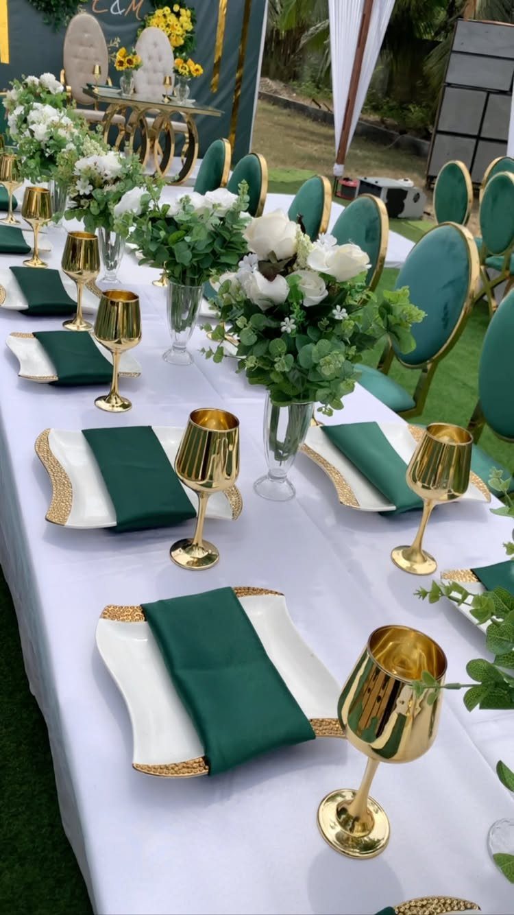
Textured gold rims on white plates give you the metallic without the maintenance of full gold flatware, which shows water spots and fingerprints under reception lighting.
Shiny wine glasses carry a different gold, more mirror than matte; mixing 2 gold finishes works when they sit apart, plate rim against glass body, not adjacent.
Dark green napkins, almost emerald, ground the setting and keep the gold from floating. I would use this combination for outdoor or garden weddings where greenery is already present; the napkins extend the landscape onto the table.
The square plates are a modern choice that the gold rim softens. Square plates with gold metallic edges catch the light at each corner, adding a layer without adding a color.
7. Blush Floral Arrangements and Gold Accents
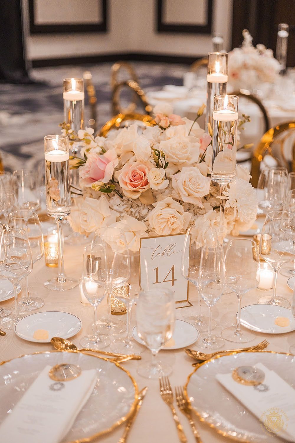
Blush roses read young and romantic; gold keeps them from going saccharine. Spring and garden weddings already carry this palette in the landscaping, so the colors feel found rather than forced.
Gold flatware, not chargers, spreads the metallic without concentrating it. Floating candles in clear glass repeat the gold as light rather than surface, which photographs softer.
The danger is too much pink.
White napkins, not blush, break the tone, and greenery must stay sharp, not silvery. Lamb’s ear and dusty miller turn the whole thing bridal-shower sweet.
8. Cream Linens and Gold Cutlery
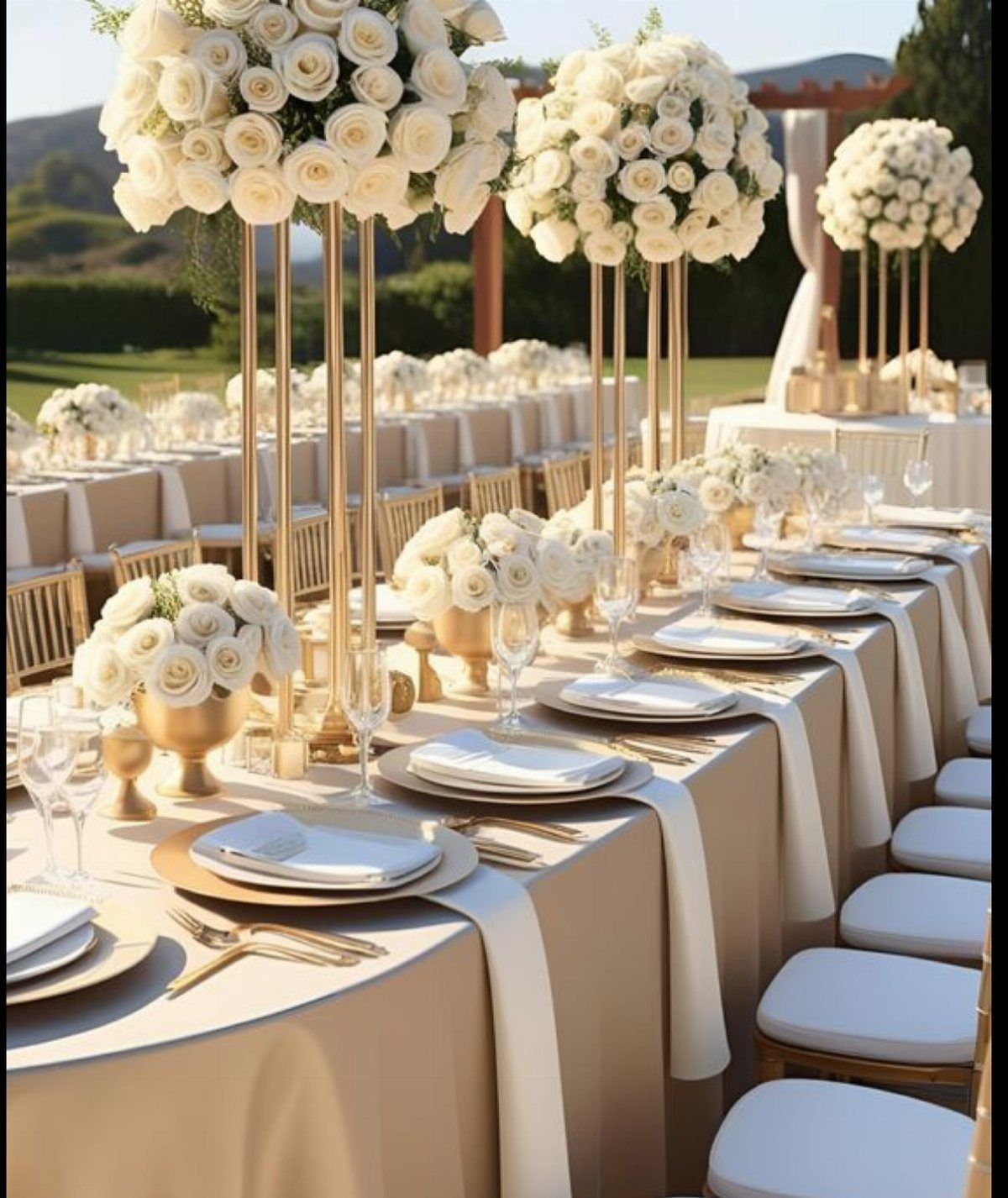
Cream outdoors reads intentional where white would fight the sky. Gold cutlery against it catches sun in a way silver cannot; the warmth belongs to daylight.
I would keep the florals white, not cream, so the linen stays the warmest thing on the table. Tall and short centerpieces together give the long banquet table rhythm without blocking conversation.
Gold chargers work here but are not required; the cutlery alone, polished not matte, carries enough metallic for open air. The risk is formality against nature: loose arrangements, not tight balls, keep the balance.

Ample Candlestick Candles: the package contains 100 pieces of red dripless taper candles, ample quantity to meet your various needs, and each is approx. 10 inches high, long size for you to use

UNSCENTED DINNER CANDLES: Scent free candles sticks, keeps your home clean from toxic fumes and unpleasant smells.

Consistently high quality - Enjoy up to 8 hours of enchanting glow from our candlestick pack, ensuring your moments of relaxation last longer. The heart of our long candlesticks lies in its 100% natural cotton wicks, allowing for a clean and even burn that resonates. Unlike others, our 10 inch candles aren't just superficially dipped in color. Each fragrance free burgundy candle is fully dyed, both on the inside and outside!
9. Sage Linens and Gold Accents
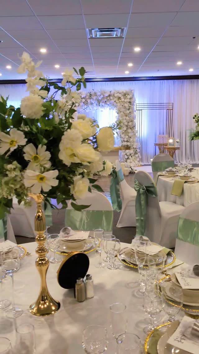
Sage against white, not against more green, lets gold read as jewelry rather than hardware. A single candelabra holds the eye at center; votives would scatter the light and weaken the effect.
I would match the napkin to the chair sash exactly, then let gold carry every metallic role: charger, flatware, candelabra. A third finish, like copper or rose gold, fragments what should stay calm.
This palette suits spring and early summer, or any room with pale wood floors. Dark wood pushes sage toward institutional; in those spaces, deeper emerald serves better.

Elegant Modern Design: The exterior of the gold flower vases features simple strip grooves, exuding a sense of simplicity, modest elegance, and timeless classicism. Sziqiqi...
10. Gold and Terracotta
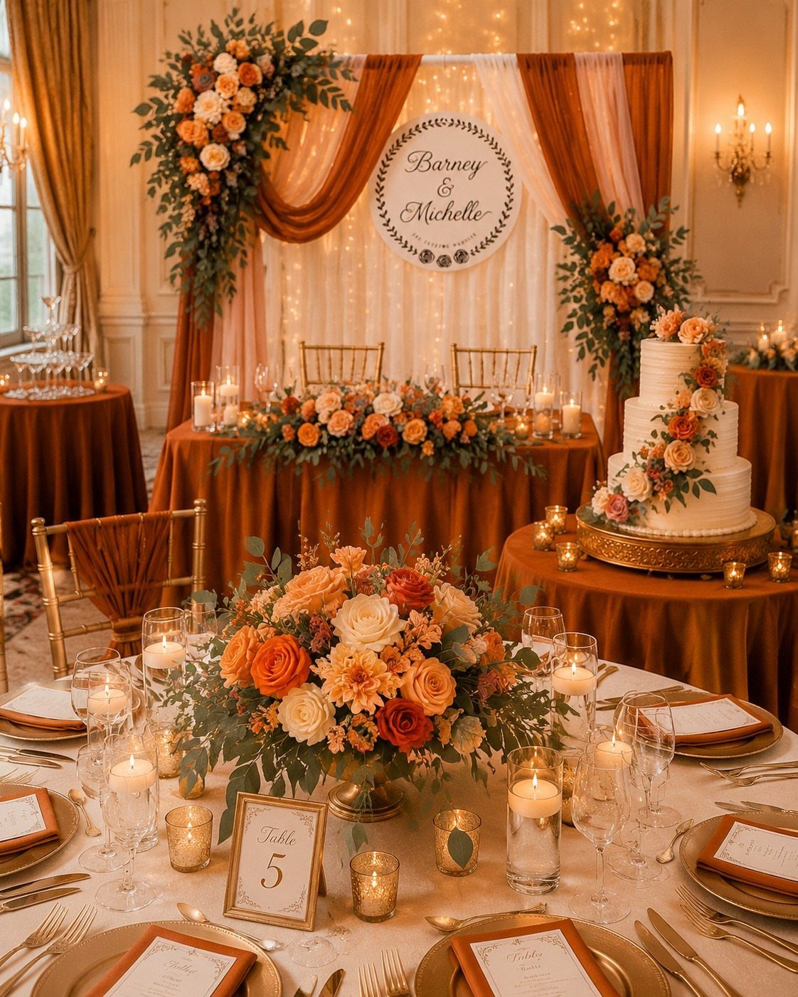
Terracotta and gold share a warmth that makes them read as found together, not paired by design. Peach flowers keep terracotta from going heavy; keeping that fruit note, rather than substituting deeper orange, preserves the lift.
Gold chargers and flatware both work here because terracotta is matte and absorbs light; the metal has room to operate. The napkins, not the dresses, carry the terracotta at table level, which keeps the bridal party distinct.
Autumn is the obvious fit, though any industrial venue with brick or rusted metal already present carries the same warmth. In a polished hotel ballroom, the terracotta arrives as costume.

Condition: Brand New Quantity: 1 Piece Materials: 100% Polyester Scuba (Wrinkle- Free) Size: 72"x 72"
11. Gold and Navy Invitations
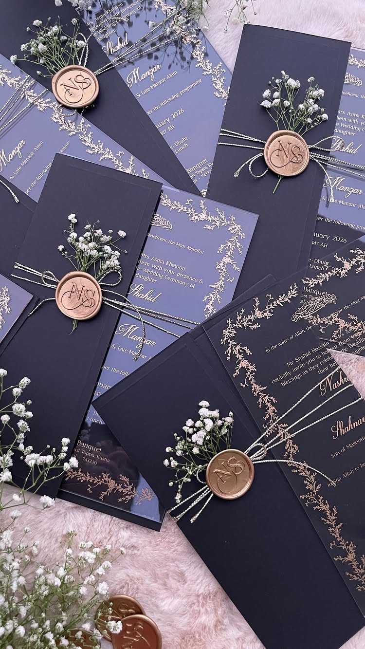
Navy cardstock with gold foil is formal without the severity of black; the gold reads as light on water rather than metal on stone. I would use this for evening weddings, winter especially, where the darkness outside justifies the weight.
A wax seal adds ceremony to the opening; twine or cord, not ribbon, keeps the texture raw against the polished foil. Translucent inserts are a modern move that the traditional color pairing accommodates without strain.
Foil stamping costs more than flat printing; the difference adds up fast across a guest list, worth it only if the invitation sets the tone guests will meet.
12. Gold Cake Decorations
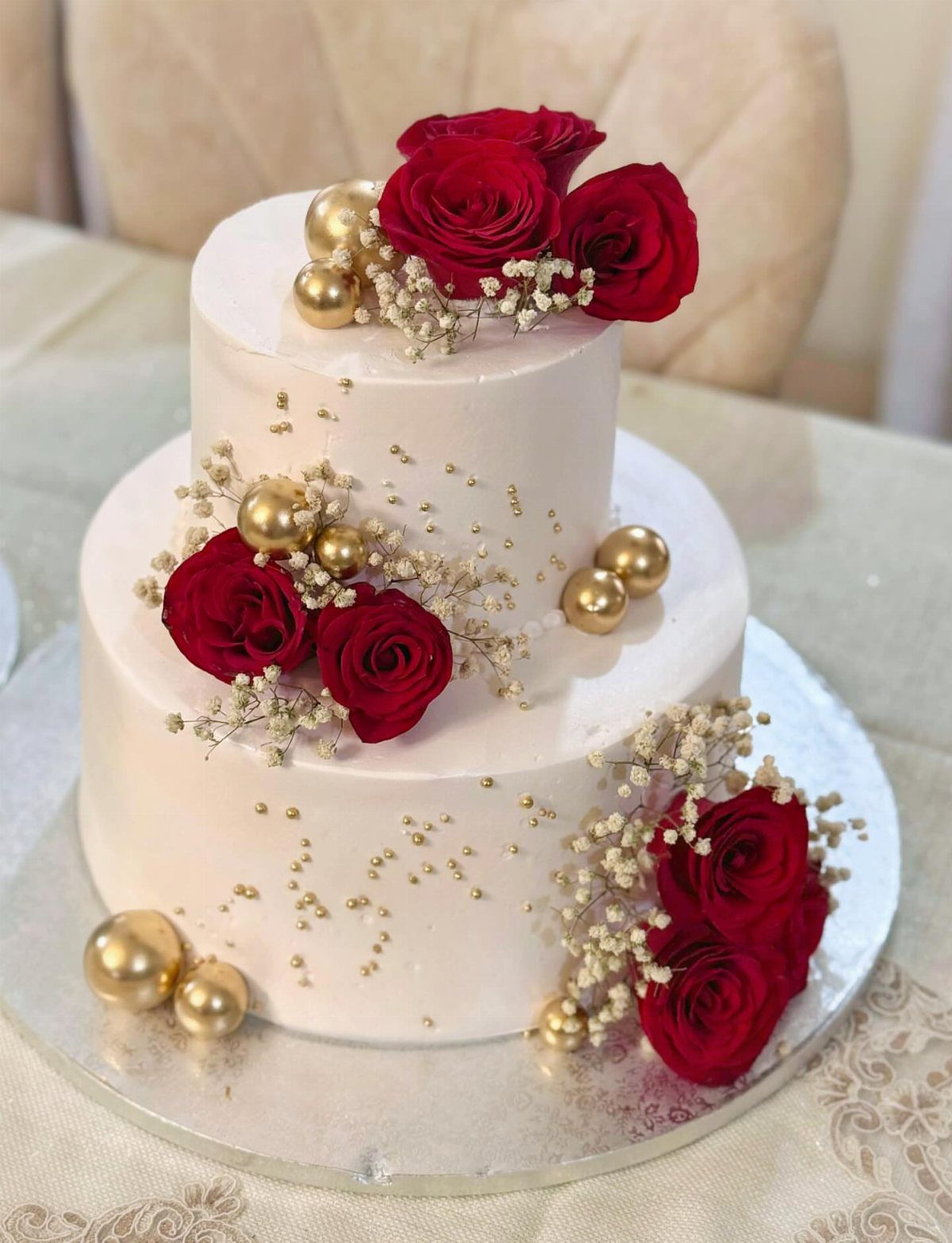
Gold leaf on cake is edible and expensive; spheres achieve similar gleam at lower cost and zero anxiety about serving metal.
I would ask a baker comfortable with metallic paints and sprays, not demand leaf from someone who does not offer it.
Red roses make a strong second color; for a purer gold statement, white or blush flowers keep the metallic central. Gold drip needs a smooth buttercream base; textured frosting catches the drip unevenly and looks accidental.
A gold script topper, the third option, photographs well but reads cute up close. I would choose it for a smaller cake or the top tier only.
13. Gold Bridesmaid Dresses
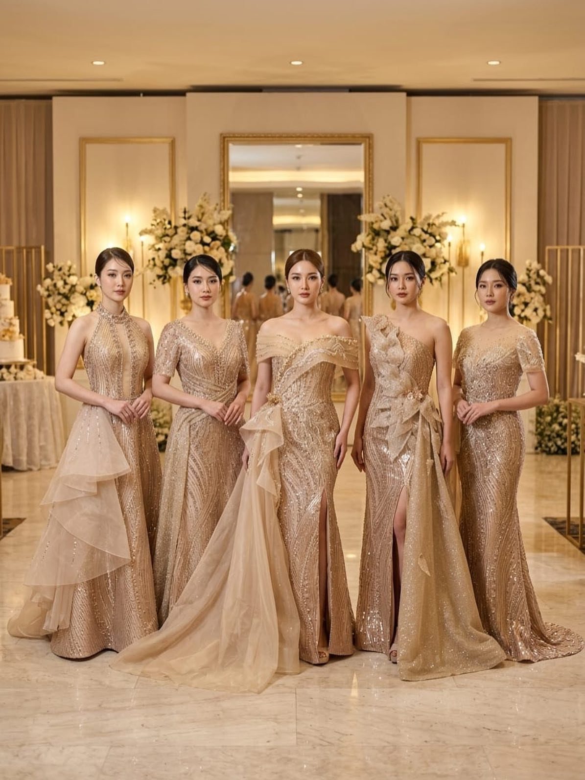
Gold bridesmaid dresses turn the attendants into living decor; the metallic carries light back to the bride rather than competing.
Floor-length satin in ochre or deeper gold reads richer than pale yellow, and sequins photograph as texture from a distance, not sparkle.
I would keep bouquets white or blush, never gold, so the dresses hold the metallic monopoly. Chocolate brown suits for the groomsmen ground the palette and keep the wedding party from floating.
The risk is uniformity: identical gold gowns read pageant. Varying the neckline or letting each woman choose her own cut in the same fabric solves this without losing the effect.
14. Black Acrylic Signage with Gold Calligraphy
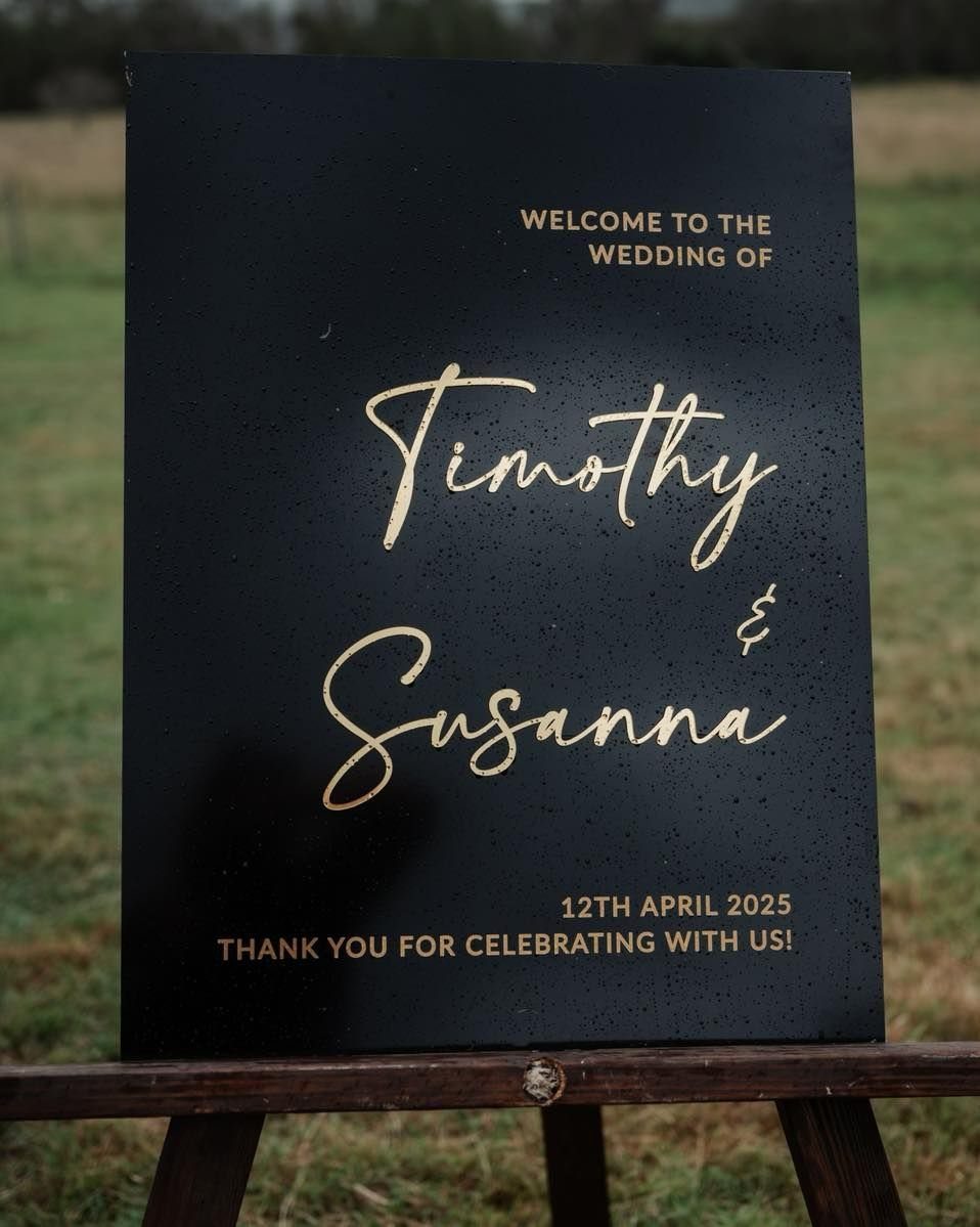
Black acrylic signage with gold calligraphy operates at the threshold where guest convenience meets decoration; it answers a practical question and sets tone simultaneously.
The gold here is foil or paint, not leaf, applied to a surface that reads as absence, so the letters appear to hang in space.
I would place this at a single point of arrival, not scatter matching signs throughout; repetition turns luxury into branding. A dark wood easel, not metal, keeps the warmth concentrated in the gold itself.
Twine or raw cord at the edge introduces texture the acrylic lacks. Skip ribbon; the gloss fights the matte black.
15. Gold Drapery
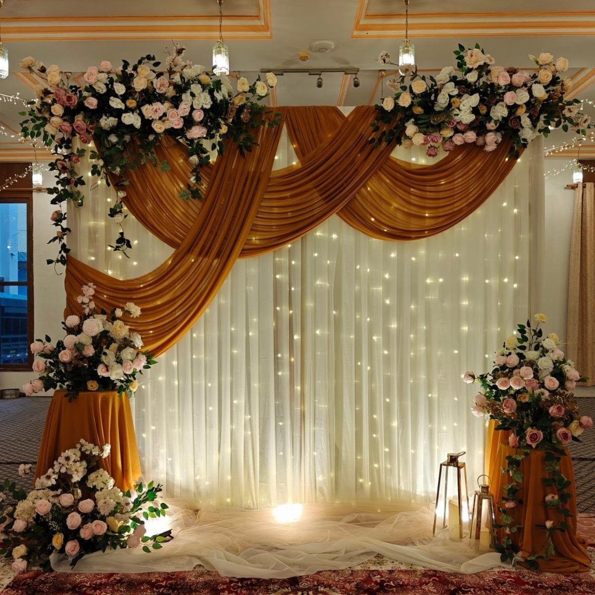
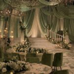
Gold drapery as ceremony backdrop turns a rented room or tent into a defined space with its own weather.
Deep gold satin over white sheers with fairy lights behind creates depth the camera reads as warmth; the fabric does the work that floral installations would cost triple to achieve.
I would keep the gold to swags or panels, not full enclosure, so light still enters and the effect remains architectural rather than theatrical.
Floral arrangements at the base anchor the drapery to the floor and keep it from reading as set design.
The fabric weight matters: cheap satin wrinkles under its own drape and photographs as shine without substance.
16. Gold and White Floral Arrangements
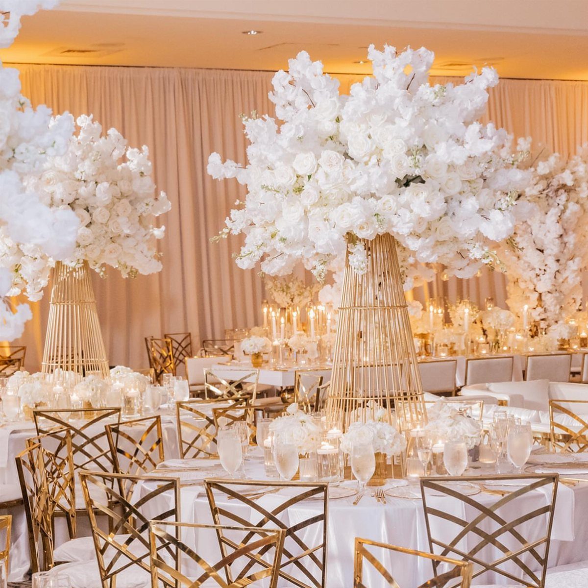
White floral arrangements on tall gold stands solve the problem of filling vertical space without blocking sightlines across the table.
I would use white roses or hydrangea, not ivory, so the contrast with the gold stays crisp.
Painted gold elements within the arrangement itself, berries or leaves, extend the metallic upward so the stand and flowers read as one piece rather than flower plus holder.
The stands must be weighted; tall and narrow tips easily during guest movement or photography.
17. Gold and Green Foliage
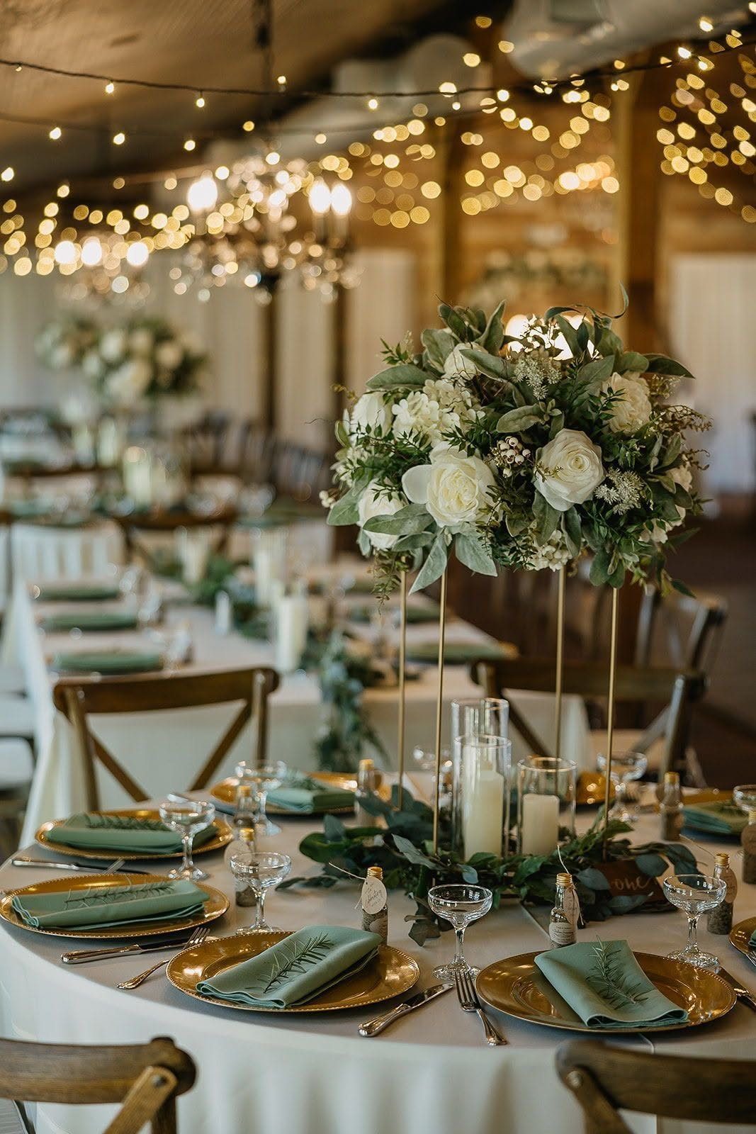
Green foliage with gold accents lets the living material dominate while the metallic provides punctuation.
Sage or deeper green napkins against gold chargers, with white roses and varied foliage in the center, keeps the palette to 3 elements that each earn their place.
Gold-painted leaves or berries within the arrangement, as some versions show, require a florist practiced in the technique; the paint must read as intentional, not damaged. I would confirm a sample before committing the full table.
In evening ballrooms the green recedes and the gold takes over, shifting the balance toward formal.
Color Combinations with Gold
Gold pairs with more than the obvious suspects.
Navy, blush, burgundy, and emerald green each carry it differently: navy makes gold read as light on dark water, blush risks sweetness without the metallic restraint, burgundy demands architectural surroundings, and emerald needs the weight of winter or dark wood to feel grounded rather than forced.
Champagne is the quieter relation, useful where gold alone would compete with candlelight rather than absorb it.
Deep ochre, tan, and light champagne extend the metallic into a range that reads cohesive across stationery, linens, and floral without repeating the same finish everywhere.
The mistake is treating these combinations as interchangeable. A summer garden accepts blush and gold as found; the same pairing in a December ballroom arrives as costume.
Gold in Wedding Decor
Gold operates at every scale of decoration, not merely as accent.
Patterned gold on envelopes introduces the palette before the day itself.
Accumulation is the real risk: each piece stays modest on its own, but the total can shift from tone into theme. I would choose two or three applications and carry them through with discipline, leaving other surfaces plain.
In a grand ballroom, cream linens and tall glass taper holders with warm amber candlelight let gold work as structure while the warmth moves around it. The metal provides the frame; the light provides the life.
Choosing Wedding Colors
Season shapes what gold can do. Summer daylight asks for cream rather than white, for loose arrangements rather than tight formality, for cutlery that catches sun without blinding.
Winter evenings justify the weight of navy cardstock, wax seals, the heavier investments that read as ceremony against early darkness.
Personal preference matters, but so does honesty about the venue.
An industrial space with exposed brick already carries terracotta’s warmth; a polished hotel ballroom does not. A tent in June has no architecture to support burgundy and gold’s formality; a room with dark wood paneling does.
The ochre-to-champagne range of metallic gold offers flexibility the single bright gold does not. Working within that range lets the palette adjust to season without abandoning coherence.
Gold Symbolism in Weddings
Gold carries associations no couple entirely escapes: wealth, prosperity, the luxury of surplus.
These are not neutral in a wedding context, where every choice carries weight against the budget a couple is managing and the atmosphere they are trying to build.
The metal can read as aspiration or as achieved standard, depending on how densely it appears.
The symbolism is ancient enough to feel inevitable, which is useful and limiting both. It does not carry the individuality of a personally chosen color; it arrives with history attached.
For some this is the point, the weight of tradition lending gravity. For others it is a constraint, the expected choice against which more personal palettes define themselves.
Gold leaf on cake, gold foil on invitation, gold thread in embroidery: each application pays a premium for the reference.
Whether the reference is worth the cost is a question of what the couple wants the day to say about means and meaning.