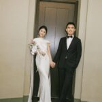
These 13 winter wedding color schemes run from a single bridesmaid dress swap to full venue palettes carried through flowers, linens, and wood details, with most falling somewhere between: a color story you thread through three or four elements and call it done.
The one that belongs to you depends on whether your venue already brings stone walls or wood beams you want to echo, or whether you are dressing rented ballroom chairs from scratch.
Renting black linens saves the headache of spotting every crumb before the photographer arrives.
1. Blush Pink Bridesmaid Dresses
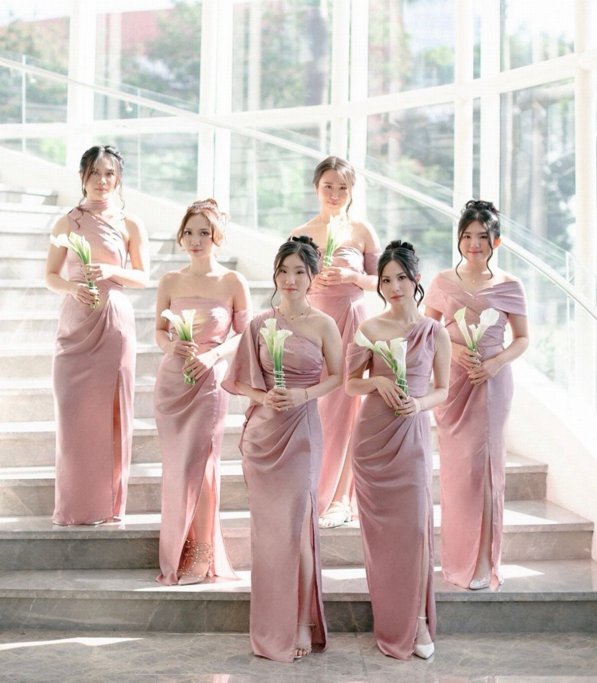
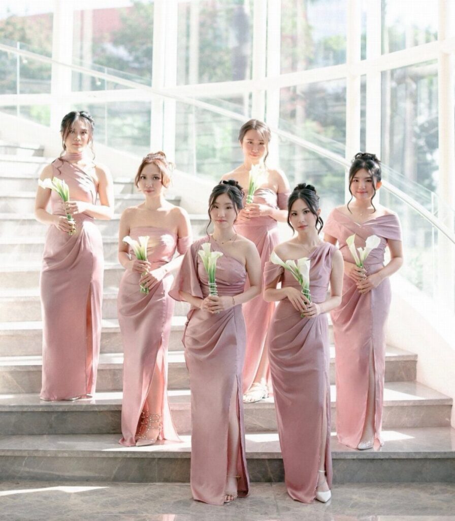
Blush pink reads warm against winter skin tones where stark white can wash out.
The satin finish in the photograph catches candlelight without competing with the bride, and letting each bridesmaid choose her own neckline keeps the palette from feeling too uniform.
Calla lilies stay clean and graphic; their white keeps the look anchored so the pink does not drift into spring territory.
I would add one deeper tone, a burgundy ribbon or a dark lip, to remind guests what season they are in.

Features:Satin mother-of-the-bride dress featuring cape sleeves, mermaid cut, pleated design, floor length and built-in bra.

MATERIAL: This assorted faux dusty pink rose made of premium soft PE foam, artificial roses replicate the natural texture and lifelike appearance of fresh cut blooms for realistic visual and tactile experience. Petals undergo dyeing process,the transition of dusty rose, blush pink, light pink and white color is more natural.Which lend them the look and feel of fresh flowers, will never wilt or fade.

Materials: Silk roses, Ribbons, Rhinestone, Jewelry. Size: 8 x 8 x 10 inches (LxWxH), more suitable for bridesmaid.
2. Berry Red
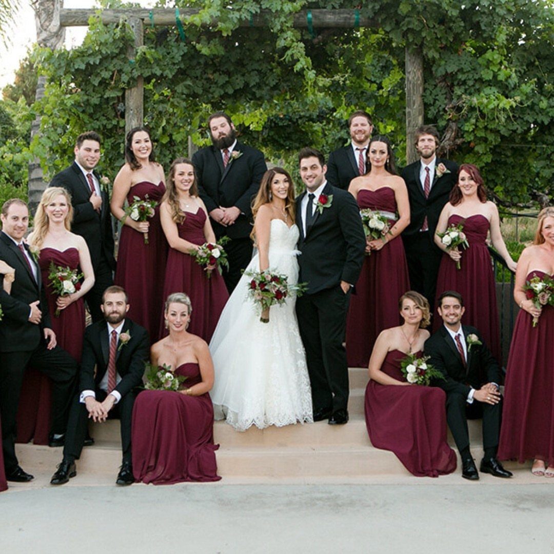
Berry red suits couples who want warmth without the formality of a true burgundy. The photograph shows the color at full saturation, strapless against black suits, and that contrast is what makes it winter rather than autumn.
A single berry tone in the dresses, mixed shades everywhere else: raspberry in the bouquet, blackberry in the table runners, a darker tone in the groomsmen’s ties.
Carrying the family through berry tones rather than matching exactly saves the endless dye-matching hunt. Cozy red blankets for outdoor photos are a practical add; guests remember being cold more than they remember centerpieces.

Total length is approximately 57.5 inches - Measurements are Bust/Chest (XS) Up to 32.5 inches (S) 32.5-35 inches (M) 35.5-37.5 inches (L) 38-40 inches (XL) 40.5-43 inches (2X) 43.5-47 inches (3X) 48-51.5 inches (4X) 52-55.5 inches

Polyester/Spandex,Fabric is Elasticity,Stretchy,Comfortable

TOP CHOICE: Women's Casual Deep- V Neck Sleeveless Vintage Wedding Maxi Dress.Women lady sexy convertible multi way wrap dress plus size full length long maxi dress wedding bridesmaid party formal bandage off shoulder slim fit V neck cocktail homecoming evening gown ;
3. Moody Florals
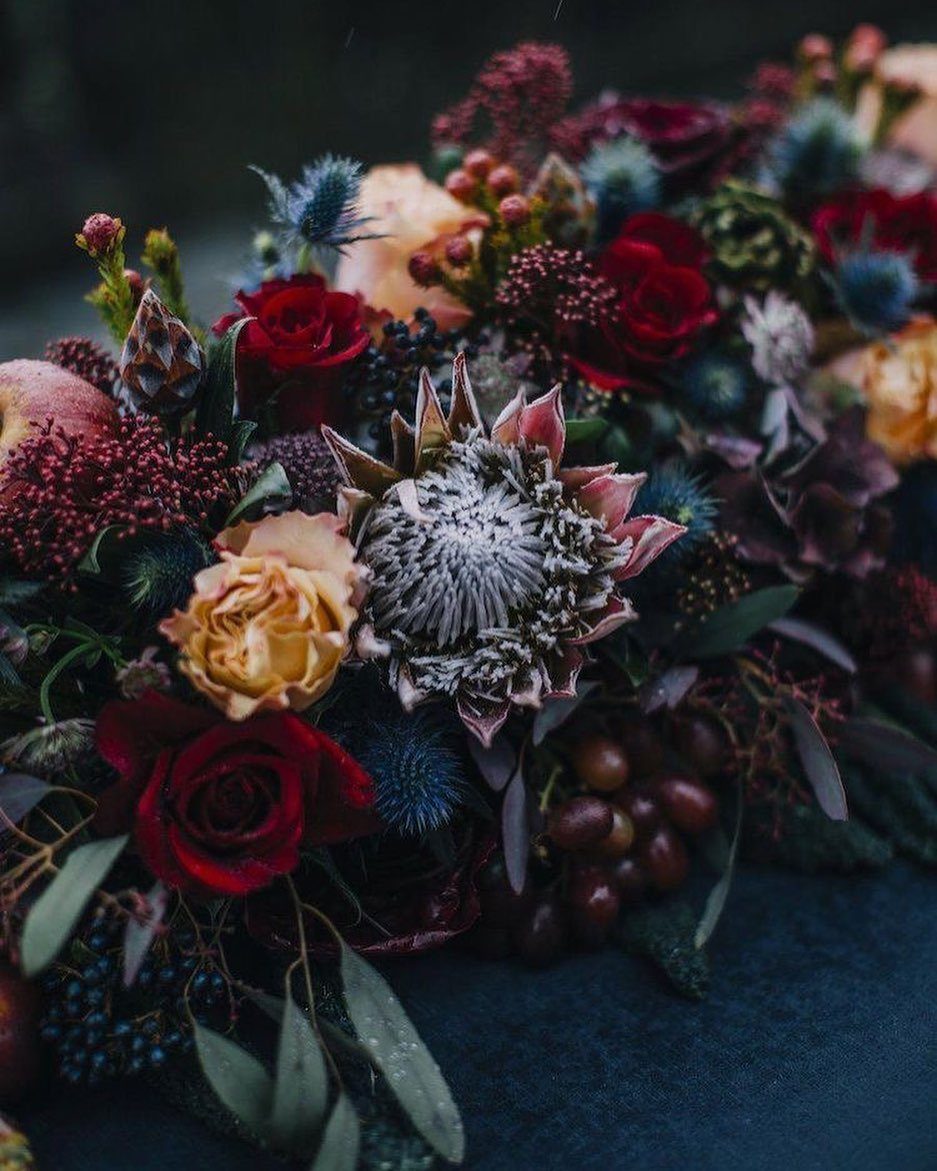
Jewel tones work in winter because the light is already low and dramatic; these florals do not fight the season, they use it.
The protea and thistle in the arrangement add texture that reads expensive without the cost of out-of-season roses.
Dark red lips on the bride tie the look together without requiring her bouquet to do all the work.
I have seen this palette go wrong when every element competes; the photograph keeps the tablecloth dark and simple so the flowers command attention.
One arrangement this bold per table is enough. More, and the room starts to feel like a set.

Realistic Natural Appearance: you will receive 6 pcs artificial thistle flowers designed to mimic the spiky, textured look of real Eryngium; Each stem features 3 vivid blue...
4. Modern Bouquet in Warm Earth Tones
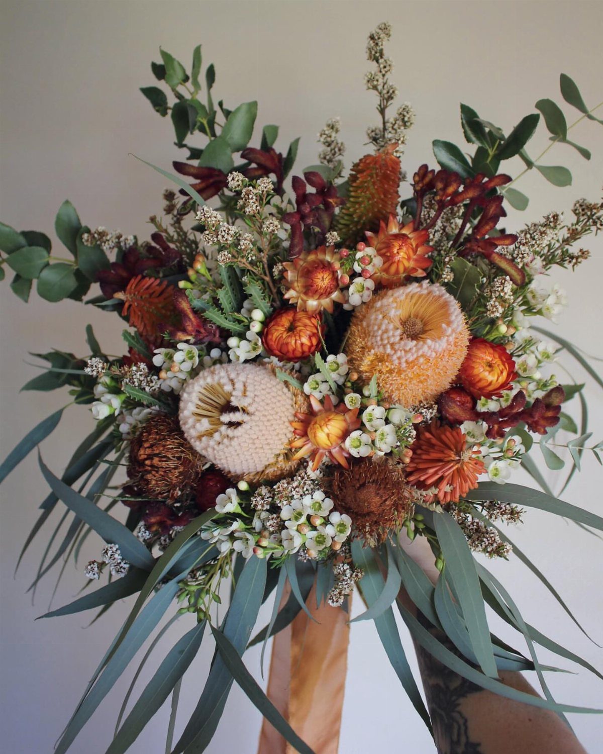
The banksia and strawflowers in this bouquet dry well, which matters for a winter wedding when fresh local options are thin.
Earth tones read modern because they step away from the expected red-and-green; the tattooed hand in the photograph signals the audience this palette serves.
Check whether your florist sources these flowers reliably in January, or whether dried stems are the plan from the start. The eucalyptus will scent the bridal suite; decide if you like it, because the oil lingers on skin.

[Material] - This burgundy satin ribbon is made of polyester with a smooth, soft surface and elegant glossy finish

Premium Soft Chiffon Ribbon: Made from high-quality polyester chiffon, this burgundy ribbon for gift wrapping is smooth, lightweight, and silky

Size: 1 inches wide ribbon, continuous 25 yards per spool without splices, to meet your creative ideas
5. Icy Blue and Silver
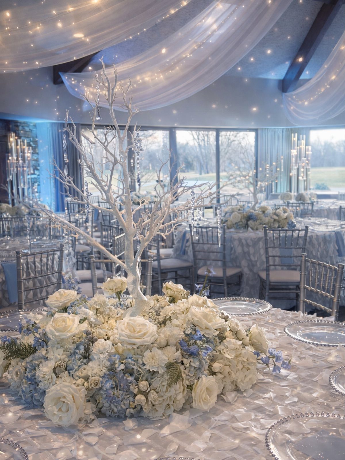
This palette lives or dies on the quality of the silver.
The Chiavari chairs and textured linens in the photograph show real metal sheen, not gray plastic, and the painted branch centerpiece is a DIY option that scales cheaply if you start collecting branches early.
Blue hydrangeas brown at the edges in dry heat; venue humidity matters more with this flower than with most.
The white roses are the safe choice, the blue the statement, and the crystals catch light that winter afternoons do not provide much of.
I would add more candles than the photograph shows, or the room risks feeling cold rather than frosty.

【Durable Material】 table runner is made of premium polyester linen blend, more durable, very soft skin-friendly.

Reliable and Strong Material: this 12 piece table runners set is made of quality black lace, soft to the touch, comfortable and durable, with tighter braided threads, not easy to loosen, delicate, resistant to tearing, pulling or scuffing; In addition, the embroidery lace is spread out, adding a lazy atmosphere

Material: Crafted from a premium blend of cotton and linen, this table runner offers a luxurious touch to any table setting.
6. Forest Green and White
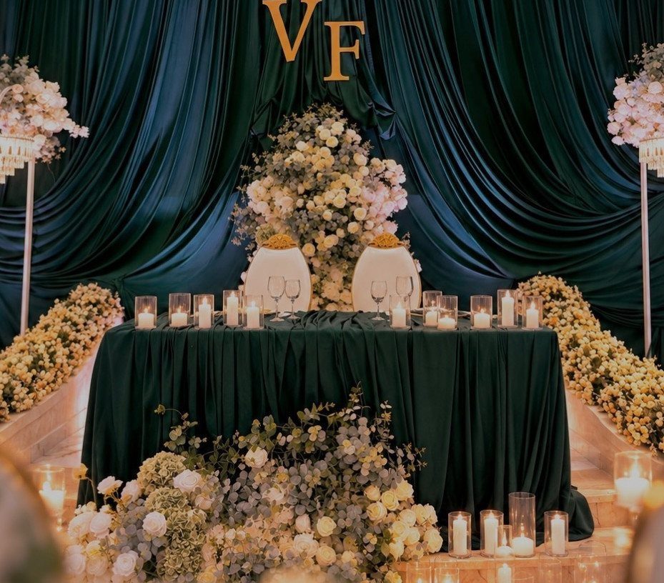
Forest green linen is a rental item most catalogs carry for holiday parties, which keeps the cost down and the availability up.
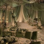
The sweetheart table in the photograph uses the green as a ground, not a wall; white roses and candlelight become the focus because the eye has somewhere dark to rest.
The draped backdrop curtains repeat the linen color and make a single table feel like a room within a room.
Check whether your venue allows fabric on walls before booking this look. Pewter place settings extend the palette without adding another color; matte metal reads winter where gold would read holiday.

1.Features: High Quality Silk Satin Material and Off the Shoulder Details ,100% Hand Made,Light Weight Comfortable,Softer,Breathable,Fully lined and Built-in Bra and Easier to Wash, making it the perfect choice for spring weddings, evening parties, and wedding guest occasions.

【Romantic Touch】This is a clear bright color pillow cover with wonderfully constructed, the rosettes add a nice flare to the design, gives that romantic touch to your bedroom, it would be the perfect finishing touch for your redecorating project!

Fabric:Crafted from high-quality satin fabric, this satin bridesmaid dress features a smooth, delicate touch and a refined soft luster. This satin fabric ensures excellent drapability, making the dress fit the body gently with natural and smooth lines, modifying the figure perfectly.Soft, skin-friendly and breathable,brings comfortable wearing experience for long-time dressing, ideal for various scenes.
7. Sage Green and Silver
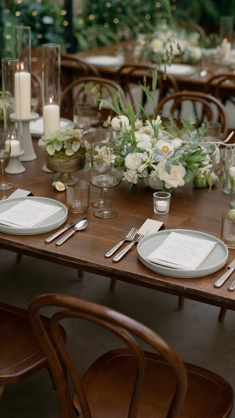
Sage green ceramic plates against raw wood keep the palette quiet enough that silver flatware reads as jewelry rather than flash.
The smoky glassware in the photograph is the detail that stops the table from feeling too pastoral; without it, the look drifts toward spring garden party.
Rent the plates if you can find them; sage green ceramic is a buy-only item at most retailers and the per-piece cost adds fast.
Check whether your caterer charges extra for non-standard dinnerware, since the weight and glaze differ from their usual stock.

Material: Made of double-layer fabric, the inner layer is made of high elasticity, skin friendly, high-quality non transparent fabric, soft, comfortable and breathable, and the outer layer is made of semi transparent mesh fabric, light and breathable, hazy and sexy, highlighting a romantic atmosphere; Different color collision designs make you more sexy and charming.

Fabric:The top of see-through soft lace, and the skirt is skin-friendly chiffon, bring you a comfortable feeling.
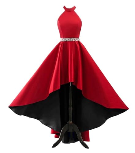
Features: High Low Satin Prom Dresses for Women 2026,Halter Prom Dresses with Pockets,Prom Dresses for Teens,Glitter Beaded Prom Dresses,Ball Gown with Pockets,Hi-Low Wedding Guest Dress,Sparkly Satin Homecoming Dresses Long,Beach Maxi Gowns.
8. All-White and Gold Elegance
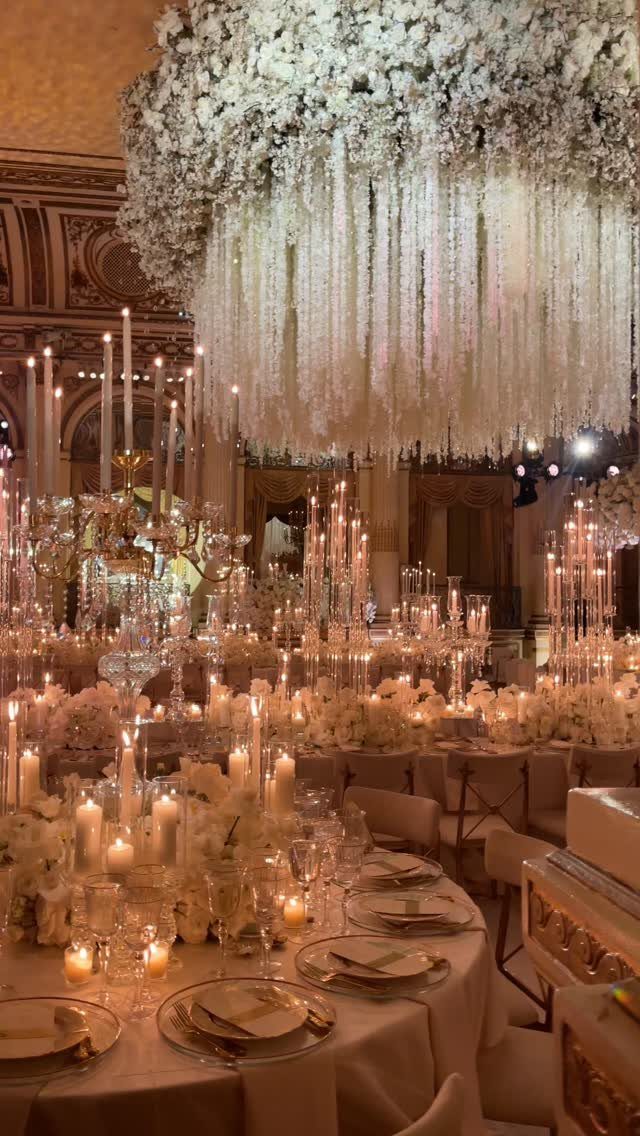
Suspended floral installations this size need structural engineering; the photograph shows a ceiling treatment that likely required a rigging team and a venue with load-bearing points.
Budget for that before falling for the look, or scale down to a single chandelier-style piece over the head table.
Gold-rimmed tableware is rental-standard at most full-service houses; the real cost is in the labor to set and polish each piece.
White linens are the safe base, but the gold needs enough candlelight to activate it, or the room reads beige. I would add uplighting in a warm amber, not cool white, or the metal turns flat.

Quantity: as show in the picture,about 3-4 ounces( 90-100g ) Length: about 18 inches / 45 cm. Flower symbolism :Quietly waiting and waiting, resisting aggression, strict,...
9. Rustic Winter White and Wood
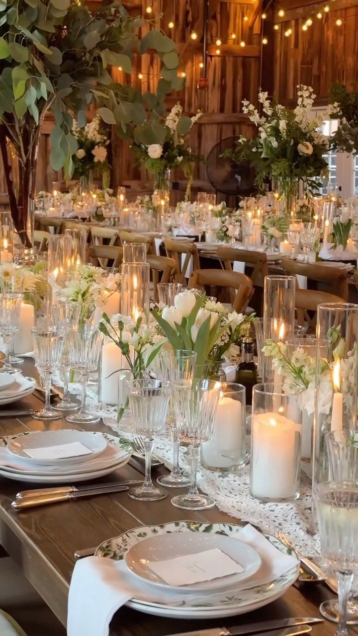
A bare wood table in a barn already carries the whole idea; the white florals and pillar candles are there to keep it from feeling unfinished.
The string lights in the photograph are the cheap part and the necessary part, since barns swallow light.
Check whether your venue provides the tables or rents them; farm tables are a specialty item in most markets and the delivery fee runs high.
Pillar candles in glass cylinders are safer than tapers in drafty spaces, and the glass doubles the glow. Eucalyptus or baby’s breath keeps the floral cost down; the wood does the visual work.

Size: Satin ribbon measures 4" wide and continuous 10 yards(30 ft) long in a complete roll in a paper box. Perfect size for chair sash, decoration for party, wedding decor, large bows making, indoor and outdoor decoration and ribbon crafts making

Package Includes: You will receive 1 roll of burgundy velvet ribbon for Christmas, continuous 10 Yards long,5/8 inch wide. The dark red ribbon is great for making gorgeous Christmas tree bows, gift bows and crafts, enough to meet your decorating needs

You will get 3 rolls and 30 yards in total. Each roll: 1 inch x 10 yard.
10. Black, Sage Green, and Gold
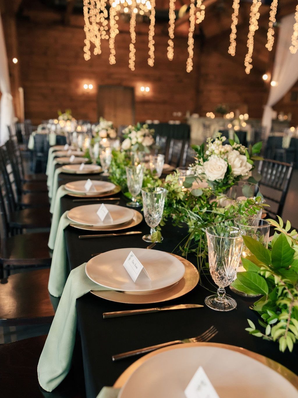
Black tablecloths absorb light and hide stains, which makes them practical for a long reception, but they need the gold chargers to keep the table from reading as a void.
The sage green napkins in the photograph are the bridge color; without them, the palette is too stark for a wedding.
Renting black linen saves the headache of spotting every crumb, which is why the Introduction recommends it over buying.
The greenery runner is a lower-cost alternative to full floral centerpieces, though it needs to be dense or it looks skimpy against the dark ground. String lights above, not just on the table, keep the black from flattening the room.

Size Guide: This farmhouse table runner is 12x48 inch, suitable for small tables such as coffee tables and tea tables. It can also decor and protect other furniture that fits the size of the table runners like sideboards. The length may have a slight deviation due to manual tailoring and there may also be a slight color difference due to the light and display screen. You can refer to the size chart in the picture and measure your table to choose the proper size.

PRODUCT - Black Linen Table Runner, 14 x 48 Inch; handcrafted by specially trained artisans in small batches.

Size : 12 x 48 inches. If you want 8-12 inches of drape on each side of the table, choose the boho runner that is 16-24 inches longer than the table.
11. Deep Teal and Burnt Orange
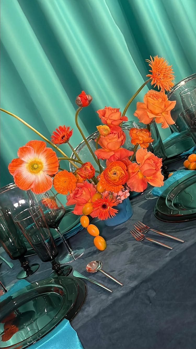
Deep teal and burnt orange is the palette for couples who want their wedding to feel like a designed object rather than a seasonal default.
The kumquats in the centerpiece are the tell: this host chose fruit over filler, and the acidity of the orange against the cool table reads intentional rather than accidental.
Teal glassware is a rental specialty; confirm availability early, since most houses stock clear, amber, or cobalt before teal.
The deep teal tablecloth in the photograph is darker than the glassware, which creates depth; matching them exactly would flatten the look.
Orange ranunculus is a winter import and the price reflects it; local citrus and forced branches stretch the same feeling for less.
12. Burgundy, Pink, and Blush
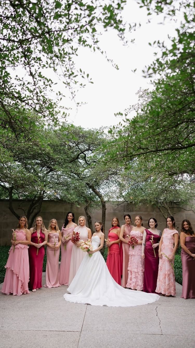
A gradient bridesmaid lineup solves the color-matching problem by refusing to solve it; each woman wears the tone that flatters her, and the group reads as coordinated rather than uniform.
The photograph shows a full lineup of bridesmaids, enough range to make the gradient visible; with fewer attendants, limit the palette to 3 adjacent shades.
Order swatches before committing to dresses from different makers; "burgundy" spans purple-brown to red-black depending on the house, and a gap in the gradient shows.
The bride in white against this field needs a clean silhouette; lace or heavy beading competes with the color story behind her.
13. Evergreen and Pinecone Accents
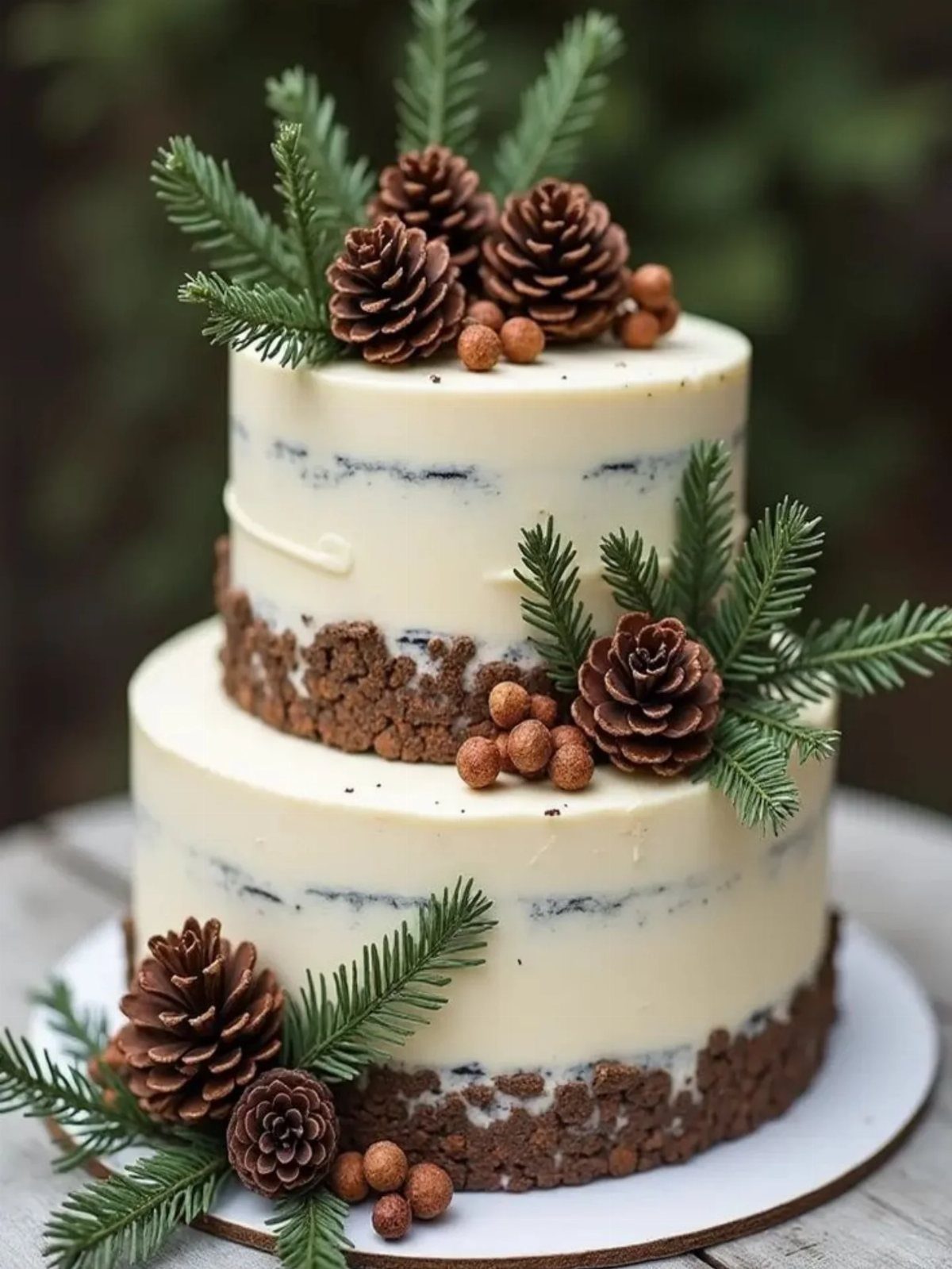
Evergreen and pinecone accents work because they are already winter; no guest wonders why they are here. The semi-naked frosting in the photograph leaves the cake looking finished but not fussy, which suits a palette this rustic.
Fresh evergreen oils can seep into buttercream over a few hours. If the cake sits out before the cut, expect the flavor to shift; bakers usually add the greenery last for this reason.
Pinecones meant for display need to be cleaned and sealed, not gathered from the yard; craft suppliers sell food-safe versions ready to wire.
This is the option for couples whose venue already has wood, stone, or glass and who want the décor to feel found rather than bought.
Color Combinations for Winter Weddings
Winter wedding color schemes fall into 2 camps: the ones that work with the season and the ones that fight it.
Classic pairings like burgundy and blush, or forest green and white, borrow directly from what is already outside the window.
Unique palettes, such as deep teal with burnt orange or sage green against black, require more deliberate sourcing but reward the effort with photographs that read as intentional design rather than seasonal default.
The 2017–2018 cycle favored berry tones and mixed reds heavily; those palettes still hold up, though couples now reach more often for earth tones and smoky glassware that would have read too modern then.
Your choice should survive the year it is pinned; avoid anything tied to a single trend cycle unless you are prepared to date your album.
Fuel your winter wonderland wedding dreams and gather some inspiration for a unique wedding with these 17 color palettes that’ll have your guests totally swooning.
Incorporating Seasonal Elements
Seasonal elements in a winter wedding are not limited to pine branches and plaid. Evergreen and pinecone accents work because they belong to the season naturally, though fresh evergreen oils can alter buttercream flavor if left in contact too long.
Citrus fruit, such as kumquats in centerpieces, offers acidity and color without the predictability of holly berries.
Textures matter more in winter than in other seasons; the light is lower and surfaces catch candlelight differently.
Satin finishes on bridesmaid dresses, smoky glassware, and metallic linens all use this. Check with your florist whether stems will be fresh-dried or purchased dried; the cost and lead time differ.
Choosing Attire
Attire for a winter wedding starts with the reality of getting from car to venue without shivering through the ceremony.
Groomsmen in black suits with berry or burgundy ties carry the palette without matching exactly, which saves the dye-matching hunt.
Creating a Cohesive Look
A unified winter wedding palette depends on carrying one color through multiple materials while varying the others. Using a color family rather than matched shades saves cost and avoids visual monotony while still creating a cohesive look.
Metallic elements need consistency in quality; silver reads as plastic or jewelry depending on whether it is real metal sheen or gray paint.
Check venue constraints early.
Fabric on walls, load-bearing points for ceiling installations, and humidity levels for blue hydrangeas all affect what you can actually execute. The cohesive look is built from what the space permits, not just what the board pins.
Frequently Asked Questions
What are the best colors for a winter wedding?
Deep purples, metallics, jewel tones, and classic neutrals all work well.
Berry reds, forest greens, and icy blues pull straight from a January window, while burgundy fading into blush or sage green set against black look like choices someone thought through.
The palettes that succeed are the ones that work with the season rather than fight it.
What are the trendy colors for weddings in 2026?
Emerging trends include moody florals and warm earth tones, with couples moving away from the heavy berry and mixed-red palettes of earlier cycles.
Smoky glassware, dried stems, and textures that catch low winter light are replacing brighter seasonal defaults. The shift is toward palettes that photograph as designed objects rather than pinned trends.