Earth tone wedding colors range from quiet mocha-and-beige ceremonies that ask almost nothing of a tight budget to teal-and-rust palettes that need careful balancing to avoid reading as Christmas.
What separates one choice from another is your venue’s light: the same sage shifts soft in morning windows toward institutional under warm LEDs, and rust that glows at golden hour flattens to sports-team orange by midday.
Any combination needs testing under your actual bulbs before committing, and a physical proof on uncoated stock, where earth tones absorb ink half a shade differently than screen mockups suggest.
1. Sage Green and Cream
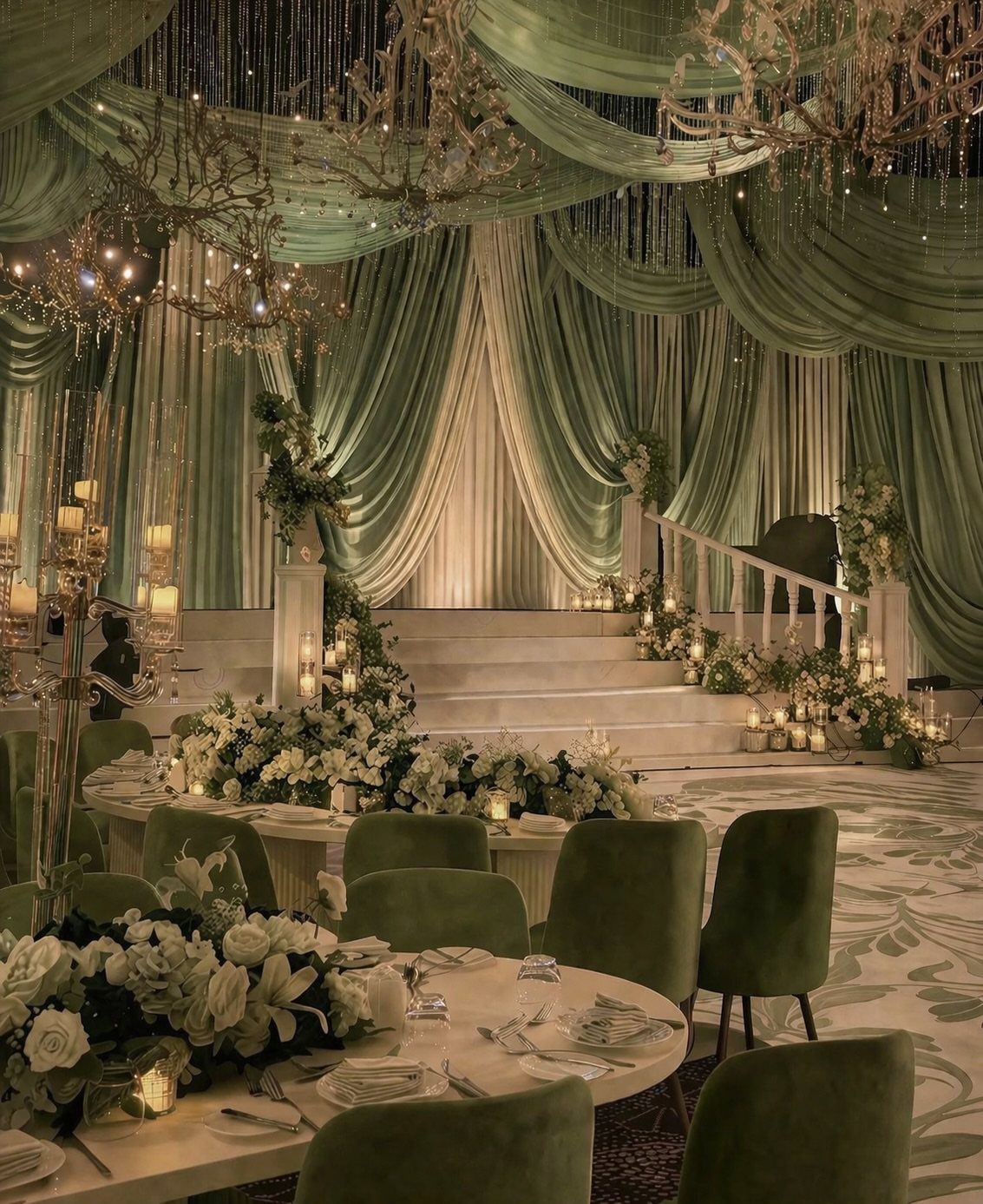
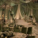
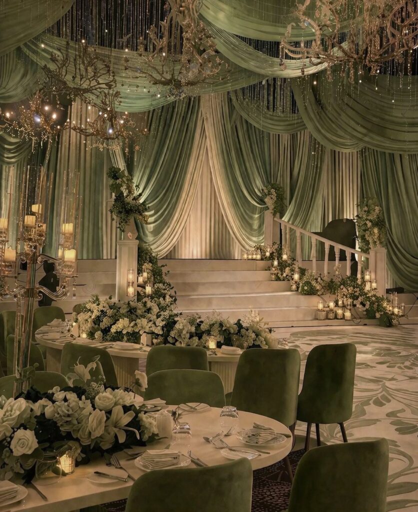
Sage green and cream pair like a meadow meeting morning light. Sage green and cream soften even grand spaces into something you can breathe in.
I would carry it through stationery first: deckle-edged cream paper with sage sketches, tied with silk ribbon. Dried figs and eucalyptus on the table carry the same muted green without fighting the linens.
For rustic settings, this combination reads as intentional rather than accidental, which matters when your venue already has wood and stone doing half the work.
The calm here comes from restraint. Add gold only where the light catches it; let the sage do the rest.

【Ring Box For Wedding Ceremony 3 Rings】 Oval art wedding ring box designed 3 slots for holding Mr and Mrs rings, highlight your rings at the center. (Fit for 1-3mm band rings, can't for too big rings, please kindly note.)

Exquisite Set: wedding decoration set includes 1 "Mr" sign, 1 "&" sign and 1 "Mrs" sign, the letters are cut smoothly and the freestanding style makes it can be moved to any position; The signs can create a romantic atmosphere for your wedding party

❤️Material: 100% Handmade with satin fabric. They will never wilt and are reusable.
2. Terracotta and Dusty Rose Bridesmaid Dresses
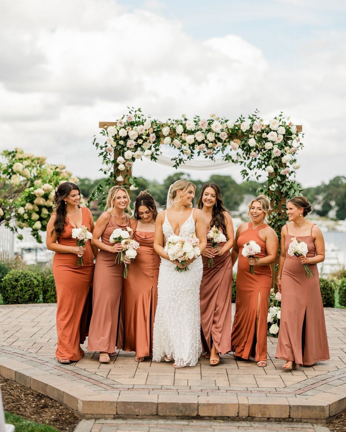
Terracotta and dusty rose work on bridesmaids because the colors shift enough between women to look individual without clashing. The range runs from orange-brown to pink, all of a piece.
Dusty rose softens what terracotta can harden into costume.
I have seen terracotta alone feel like pottery studio; paired with this muted pink, it warms. Carry both into florals, and let the linens stay neutral so the eye rests somewhere.
This palette suits outdoor ceremonies where natural light washes everything softer than you planned. Indoor venues with warm bulbs need the dusty rose amped up to keep the balance.

ONE SIZE: fits all US 0-16; PLUS SIZE: fits all US 18-24

Size Tips: Crafted from soft flowy chiffon fabric for a structured fit. Please carefully review the size chart before ordering to select your correct size

Summer Dress For Women Styles: Elegant spaghetti strap Cowl Neckline slim maxi for women formal dresses. The back is designed with adjustable back strap to show off the elegant back line. The dress’s well-designed add dimension and are cut to the mid-thigh slit, Outer layer length to ankle, revealing a flattering leg line when walking
3. Olive and Rust
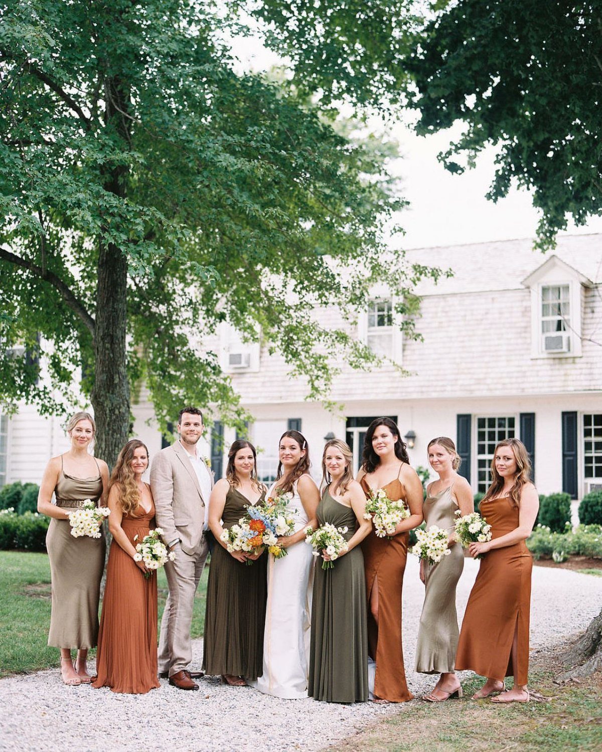
Olive and rust announce fall without the pumpkin-spice obviousness couples tire of by October. This palette holds its own against pale settings that would wash out softer tones.
I like olive as the base color because it photographs steady in changing light.
Rust pops against it without screaming. Satin dresses read formal; mixed textures, some floral print, some solid, keep a wedding party from looking like a uniformed choir.
Start with olive table linens or groomsmen ties, add rust in florals. Too much rust and the whole thing tips toward sports team.

Fabric: Made from lightweight and breathable polyester, perfect for comfort during spring and summer celebrations. It offers a smooth drape and a quality look

50Pcs Fall Balloon Set: This set includes 50 pcs of 12 inch latex balloons in 7 coordinated autumn colors: orange, burnt orange, olive green, burgundy, dark brown, nude, and mustard yellow. Comes with 1 balloon strip, 2 sheets of glue dots, and 2 rolls of ribbon to help you create a full, layered balloon display for seasonal celebrations.

4. Mocha and Beige
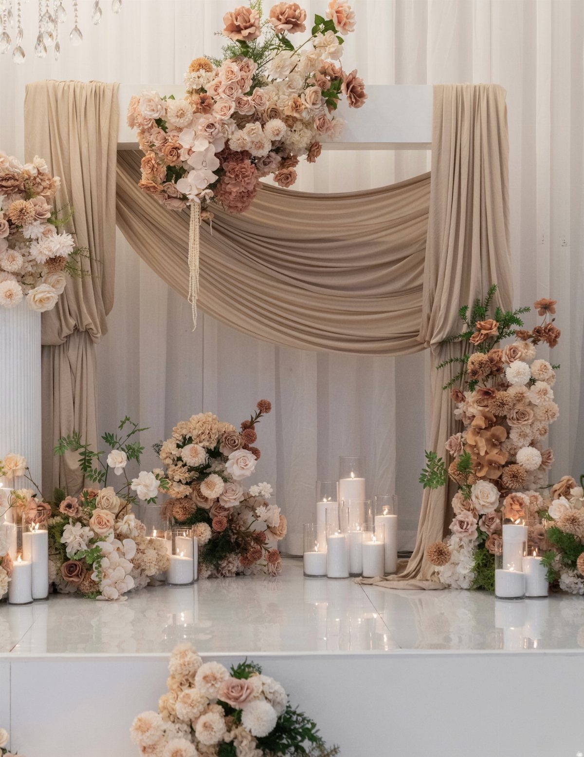
Mocha and beige ask the least of a couple while giving back calm. Draped fabric and pillar candles create a ceremony stage that feels held, not decorated.
I would build this from textiles: cream fabric over structural elements, mocha in the floral arrangements, warm beige as the connective tissue.
Pampas grass and white roses fit here without strain. Champagne and sage work as accents if kept minor; the strength of this palette is its refusal to compete.
Neutral weddings risk blandness.
The fix is texture: the sheen of the draped fabric, the matte of dried grass, the gloss of glass cylinders. Variation in surface saves sameness of color.

Expertly sewn hemmed edges: Finished with clean, straight hems for a tailored, polished look, these tablecloths are designed to lay flat and drape smoothly across the table. Reinforced edging helps maintain shape and structure through repeated use and washing, delivering a crisp appearance for everyday dining, gatherings, weddings, and special occasions.

Elegant Cutout Design: Elevate your dining with this tablecloth featuring an exquisite cutout design.The cutout design gives it such a pretty look without being too fussy and adds timeless charm and sophistication, making every meal special
Elegant Cutout Design: Elevate your dining with this tablecloth featuring an exquisite cutout design.The cutout design gives it such a pretty look without being too fussy and adds timeless charm and sophistication, making every meal special
5. Burgundy with Olive Table Settings
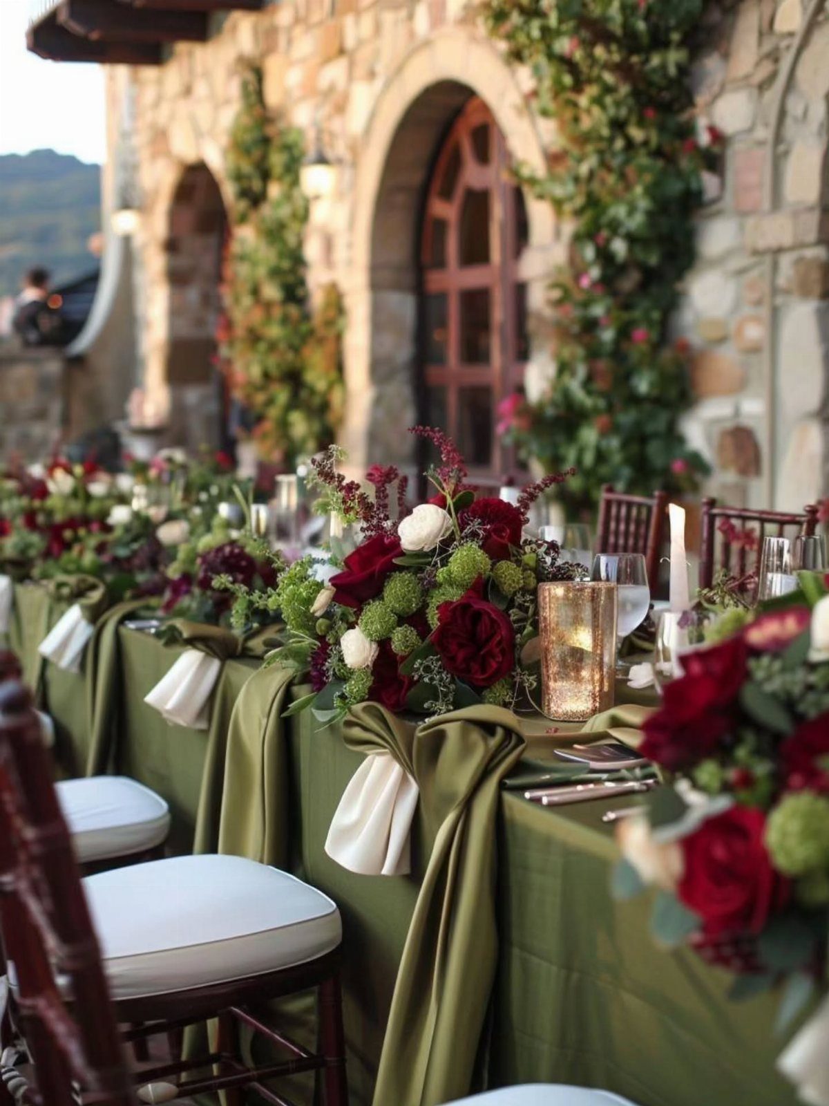
Olive tablecloths with burgundy florals reverse the usual priority where flowers lead and linens follow. The green becomes ground, the burgundy punctuation, and the whole table reads as a single decision rather than assembled parts.
Burgundy can darken a room; olive keeps it from sinking.
I would add ivory napkins to break the density, and stop there. Gold works best as flatware or candleholders, not as additional color.
In a bright modern space the colors would fight the architecture.
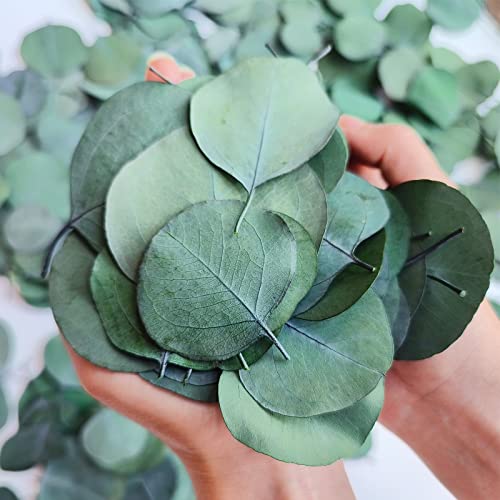
From Nature: Made with carefully selected premium natural eucalyptus leaves, using the latest preservation technology to maintain the vibrant color and excellent condition of the dried eucalyptus leaves.
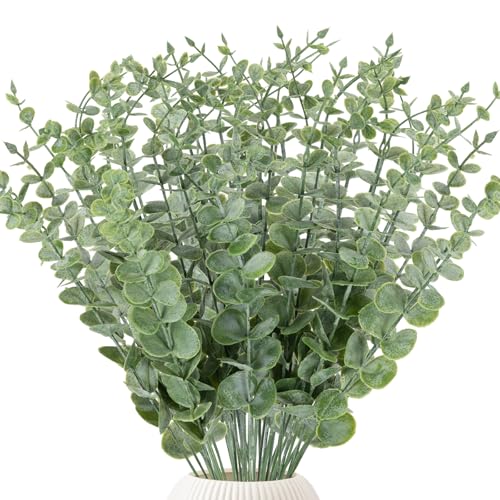
Package includes: There are total 38pcs artificial eucalyptus stems. Each eucalyptus stems is around 14.5in in length.There are 24 leaves ranging from large to small.

Sufficient Quantity for Diverse Decoration Needs:The set includes 25 artificial eucalyptus stems with ample quantity. They can be used alone for vase arrangement or freely combined with other artificial flowers to create floral designs. Whether for small-scale desktop decoration or large-area scene layout, it can be easily achieved without additional purchase.
6. Dried Florals in Arrangements
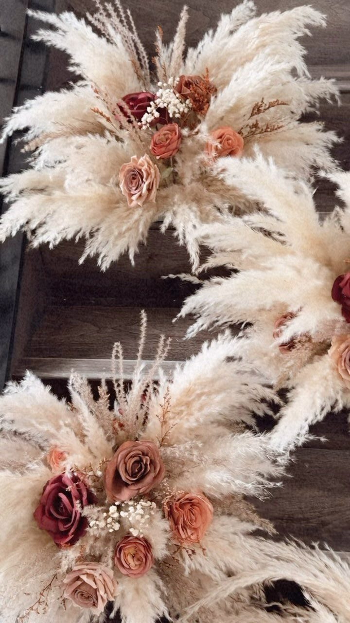
Dried florals solve the problem fresh flowers create: they die fast, cost more, and panic the couple when they wilt before the ceremony ends.
Pampas grass, terracotta roses, baby’s breath hold their shape for days, which matters when setup happens early.
The trade is movement. Fresh stems shift in breeze, catch light differently, read as alive.
Dried arrangements sit where placed, sculptural and still. I would use them for the ceremony structure and guest book table, where they are seen up close and touched rarely, and keep fresh flowers for bouquets that move with the wearer.
Add dried botanical elements to stationery: a pressed leaf on the invitation, a grass stem in the place card.

WANT EYE-CATCHING DECORATIONS? - No one would dislike our elegant upgraded tassel banner garland (5 cream, 5 sage green, 5 navy blue), each color contains 5 tassels (put together), unique designs create amazing ambiance for unforgettable moments

Package Include: 12inch sage green balloons x20, 12inch sand white balloons x15, 12inch metallic gold balloons x15, 12inch gold confetti balloons x10, ribbon x1, glue dot x20
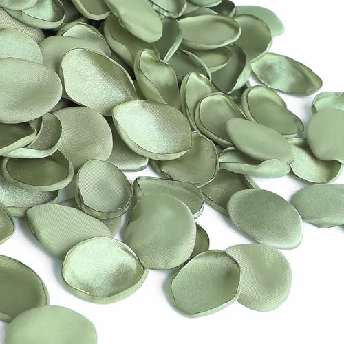
❤️Material: 100% Handmade with satin fabric. They will never wilt and are reusable.
7. Wooden Tables Decor Elements
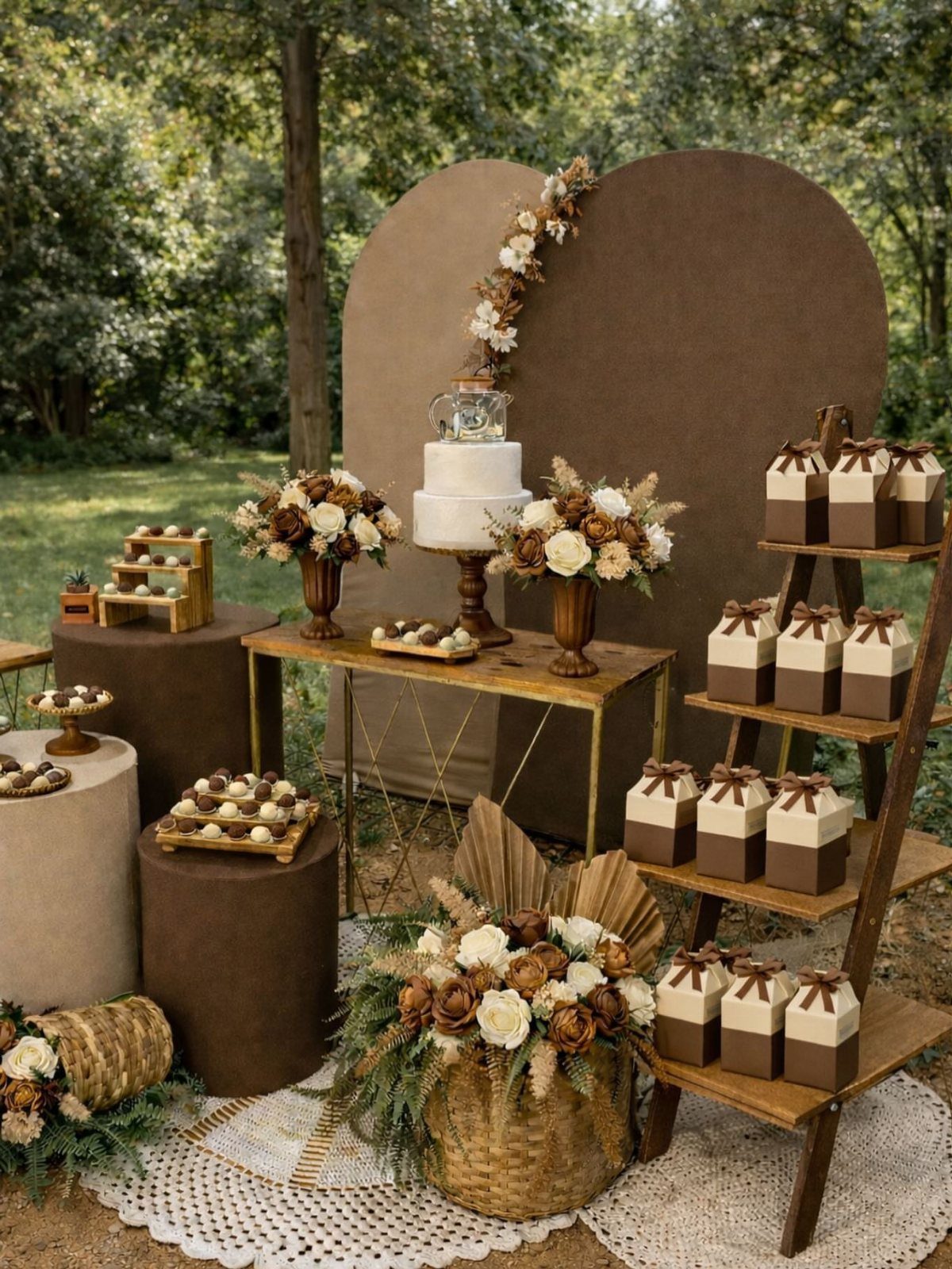
Wooden tables do what paint and fabric cannot: they bring their own history. Grain knots and saw marks read as texture in an earth tone palette, not as unfinished.
I would skip tablecloths entirely and let the surface show. Linen napkins in cream or sage soften the edge; stoneware plates sit better on raw wood than on polished.
The ladder shelving in the display works because it breaks the horizontal line of a standard table, which matters when your dessert spread needs its own architecture.
Outdoor settings forgive the scuffs indoor venues would not. Match the wood tone to your lightest color, not your darkest, or the whole thing turns heavy.

Features: These Maxi dresses features very delicate details:Short Flutter Sleeve;Round-neck;Smocking bodice at bust and waist;Self-tie and keyhole on back;Gathered elastic skirt and ruffle on hem;Floral prints;Pleated skirt,easy and comfortable fit

Features:This Halter Sleeveless Bridesmaid Dress for Women/Juniors/Teens 2025,Chiffon Halter Maid of Honor Dresses for Women,A Line Pleated Formal Evening Dress,Chiffon Empire Waist Wedding Guest Dress for Women,Halter Neck,Chiffon,Pleat,A Line,Empire Waist,Chiffon Long Bridesmaid Dress for Women,Zipper Back,Floor Length,Built in Bra.

Summer Dress For Women Styles: Elegant spaghetti strap Cowl Neckline slim maxi for women formal dresses. The back is designed with concealed zippers to show off the elegant back line. The dress’s well-designed add dimension and are cut to the mid-thigh slit, Outer layer length to ankle, revealing a flattering leg line when walking
8. Terracotta and Burnt Orange Bouquet
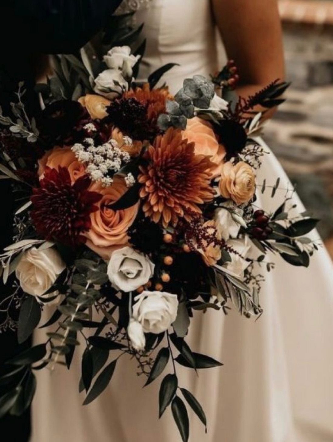
Dahlias carry the weight here. Their dense, almost geometric heads hold burnt orange without fading to red, which roses alone tend to do by midday.
Terracotta roses bridge the gap between the dahlias and the cream, so the bouquet does not read as two separate color blocks.
Dark eucalyptus does more than fill space; its blue-green cools the heat of the orange tones. Check the stems before ordering: dahlias bruise if handled early, and a bouquet built too far ahead arrives looking secondhand.
This color range photographs warm under natural light, yellow under indoor bulbs. A venue test with your florist saves disappointment.

What's Included: 6 rolls, 5 yards each - frayed cotton, pom pom trim, grosgrain, sheer chiffon, glitter velvet & eucalyptus print grosgrain, all in coordinating sage & olive green tones

Bold 2.5 Inch Width: Wide enough to create statement bows and structured designs. Perfect for gift wrapping with kraft paper, chair sashes at rustic weddings, and table runners for farmhouse-style receptions. Also ideal for seasonal wreaths and large bows on Christmas trees or spring door décor
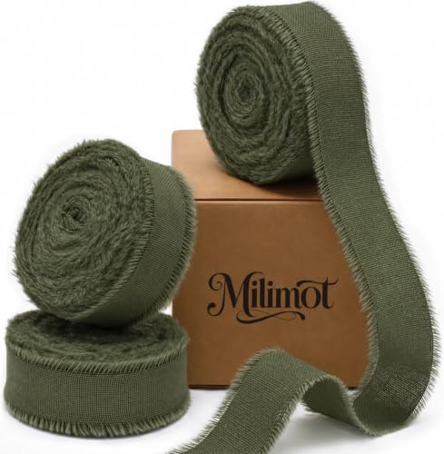
Size and quantity: 3 rolls of 5/8 inch cotton ribbon in moss green, 6 yards each and 18 yards total, in a paper box; The matching moss green ribbon set adds earthy color to gifts, dried flowers, rustic wedding details and fall tables
9. Teal and Rust Wedding Palette
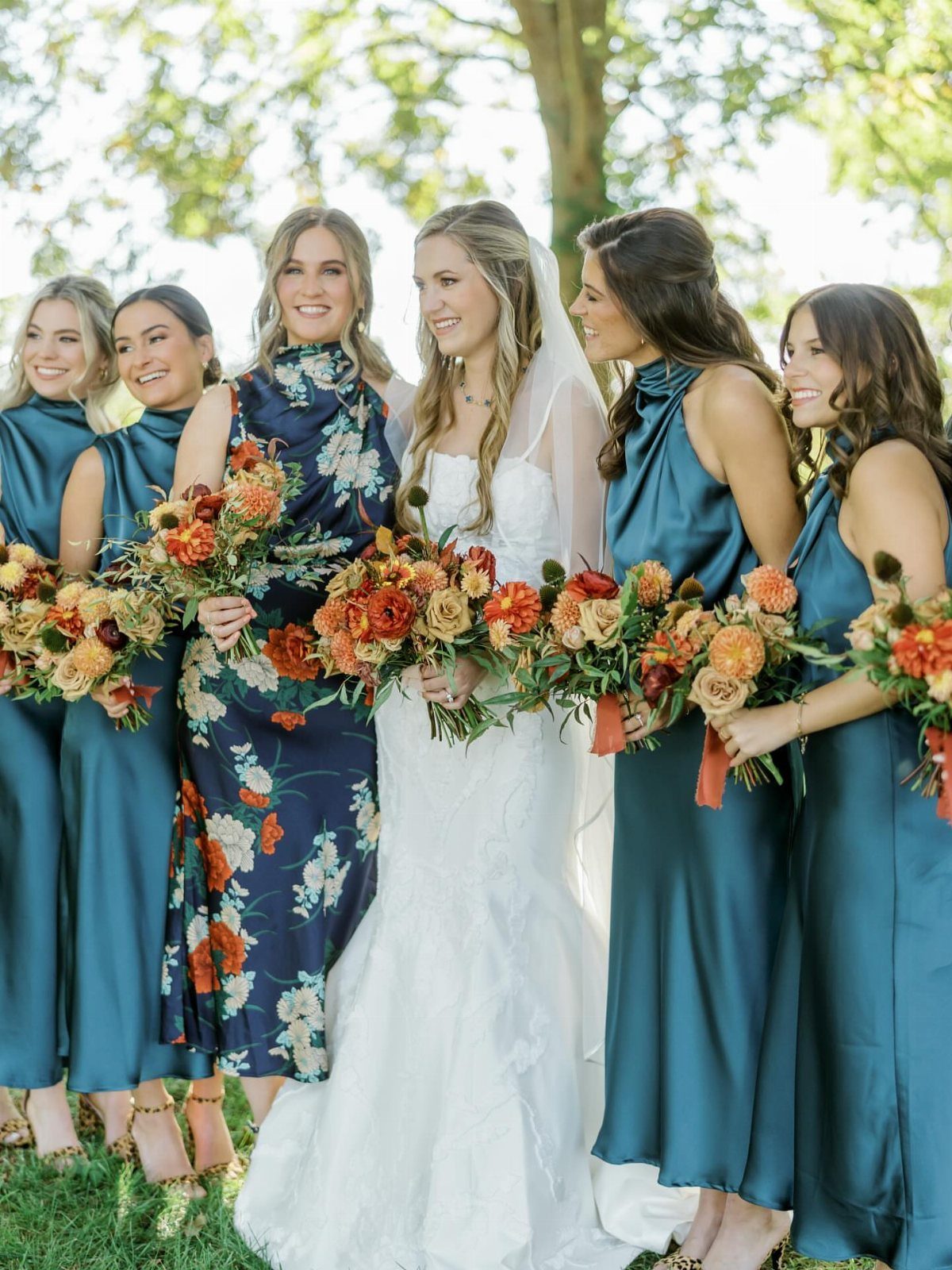
Teal against rust works because the colors sit opposite enough to spark without clashing. Satin bridesmaid dresses in teal pick up whatever sky is overhead; rust bouquets bring the warmth back down to earth.
The risk is Christmas. Too even a split between the 2 colors and the whole party looks seasonal.
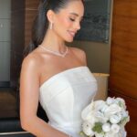
I would keep teal as the dominant share, rust and its relatives in support, with cream or tan as the bridge. The bride in white already separates the palette, so bridesmaids need no additional competing element.
This pairing suits late afternoon ceremonies where light falls golden and flatters both colors at once. Midday sun washes teal toward aqua, which cools the intended warmth.

🎁 High Quality Polyester Tablecloths: The package includes 6 beige tablecloths made of 180 GSM 100% premium polyester, the table cloths are 120" long and 60" wide, beige tablecloth for 6FT rectangular table. The table cloth covers a 6" table with a 15" drop, this rectangle tablecloth is perfect for protecting and decorating your table.

Elegant Cutout Design: Elevate your dining with this tablecloth featuring an exquisite cutout design.The cutout design gives it such a pretty look without being too fussy and adds timeless charm and sophistication, making every meal special

Each package contains 2 pieces of faux linen tablecloths. Lower cost per tablecloth, more economical and practical.
Color Combinations
Earth tones need breathing room.
Pair moss or sage with sand or almond to keep the palette from turning muddy; 2 earth tones alone can flatten into camouflage. A neutral third, even a quiet one, lets each color register as a choice.
I would test the combination under your venue’s actual bulbs before committing. Sage that reads soft in morning window light can shift toward institutional under warm LEDs.
The same sand linen looks coastal against white walls, grounded against wood. The context rewrites the color.
For couples working with printed materials, earth and moss tones on uncoated stock absorb ink differently than on coated.
Request a physical proof, not a screen mockup; the difference in saturation is usually half a shade, which is enough to throw off a carefully planned palette.

Package includes: There are total 10pcs artificial eucalyptus stems. Each eucalyptus stems is around 14.5in in length.There are 24 leaves ranging from large to small.

[Full Natural] - Selected from natural high-quality fresh Eucalyptus. There are 20 stems in the package, length is about 16''-17''. The stems cannot break easily. It is common for natural plants to have leaves of different sizes or some defects

Value Greenery Stems Pack: Come with 135 pack artificial eucalyptus leaves stems in 6 different stylesEach type varies in shape and size, providing ample quantity to wedding bouquets, centerpieces, corsages or vase fillers.
Seasonal Themes
Fall weddings borrow what the season already offers, but earth tones work against type too. A February wedding in olive and rust avoids the red-and-pink trap without feeling forced; the colors belong to no single holiday.
The real advantage of autumn is the light.
Lower sun angles warm every tone by a fraction, which flatters rust and terracotta in ways that overhead July sun does not. Schedule ceremony photos for the hour before sunset if your venue allows; the colors come through richer then.
Dried palm leaves and satin together risk a texture clash: too slick against too brittle.
I would keep the palms for structural pieces, arches or hanging installations, and let the satin move on bodies where it belongs. The same olive in both reads as intention, not accident.
Floral Arrangements
Fresh flowers in earth tones have a narrow peak. Coordinate delivery timing with your florist, not just setup time.
Clay urns do more than hold arrangements; their weight anchors tall dried grasses that would topple in lighter vessels.
The urn’s own color, whether terracotta or cream, should either match or deliberately contrast with the blooms, not sit in between where it reads as mistake.
For guest tables, I would keep arrangements below seated eye level or above it. The middle zone blocks conversation across the table, which guests remember longer than they remember the flowers.
Attire Suggestions
Satin in olive or terracotta catches light in ways that matte fabrics do not.
This flatters movement, dancing especially, but can read as shine overload under direct flash photography. A matte suit in chocolate brown against satin bridesmaid dresses gives the wedding party visual hierarchy without color competition.
Chocolate brown suits run warm or cool depending on the undertone.
Hold fabric swatches against your chosen green; olive with a yellow base fights a brown with a red one. Most rental companies stock one chocolate, not six, so order swatches early if custom purchase is an option.
For groomsmen, matching neckties to bridesmaid dresses is safer than matching suits.
A brown suit with olive tie references the palette without requiring identical dye lots across different garments from different makers. The slight variation reads as coordinated, the identical match as attempted and missed.
Frequently Asked Questions
What are earthy colors for a wedding?
Sage green, terracotta, olive, rust, mocha, beige, burgundy, and burnt orange all count as earthy wedding colors. These tones pull from soil, stone, dried grass, and weathered wood rather than bright primaries or pastels.
Dried florals, wooden tables, and linen textures carry them better than high-gloss surfaces, which is why you see so much pampas grass and raw wood in this style.
What color compliments earth tones?
Cream and beige work as the standard bridge, though sand, almond, and quiet champagne do the same job with more character.
Two earth tones together can sink into something muddy, so a neutral third color gives each one space to register as a deliberate choice.
What colors are frowned upon at weddings?
White and anything close to it stay off limits for guests, since that range belongs to the bride. The real mistake is clashing with the venue’s fixed elements rather than breaking an unwritten color rule.